

I'm a Graphic and UI/UX Designer based in Minneapolis, MN.
My skills include brand identity, packaging, illustration, wireframing/prototyping, and user/market research.Scroll down to check out some of my work!
I'm a Graphic and UI/UX Designer based in Minneapolis, MN. My skills include brand identity, packaging, illustration, wireframing/prototyping, and user/market research.Scroll down to check out some of my work!
Graphic Design
Brand identity projects, packaging design, type layouts, and more.Click on a thumbnail to view the full project!

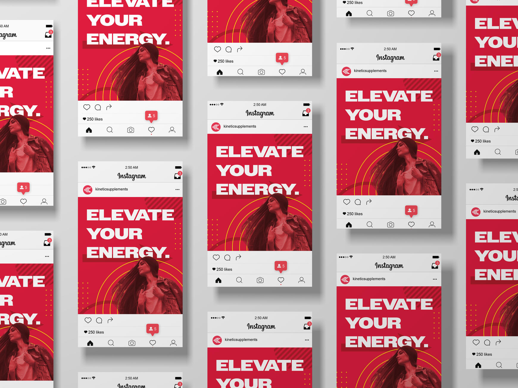
Kinetic Supplements

Genero

50's Grill

Bakken Center

Graphic Design
Brand identity projects, packaging design, type layouts, and more.Tap on a thumbnail to view the full project!

Kinetic Supplements

Genero

50's Grill

Bakken Center


UX / Redesign / Prototyping
Gopher Housing
An innovative service allowing University of Minnesota students to browse and leave anonymous reviews on popular student housing.

UX / Redesign / Prototyping
Gopher Housing
An innovative service allowing University of Minnesota students to browse and leave anonymous reviews on popular student housing.
A Little About Me
I'm a designer, artist, and musician.I received my education at the University of Minnesota Twin Cities, graduating in May 2025 with a bachelor's in Graphic Design and a minor in UX Design.I have freelance experience and have done projects in many areas including website redesign, branding, and magazine layout. I enjoy designing for individuals in my community.Feel free to connect with me on LinkedIn!

Let's Connect.

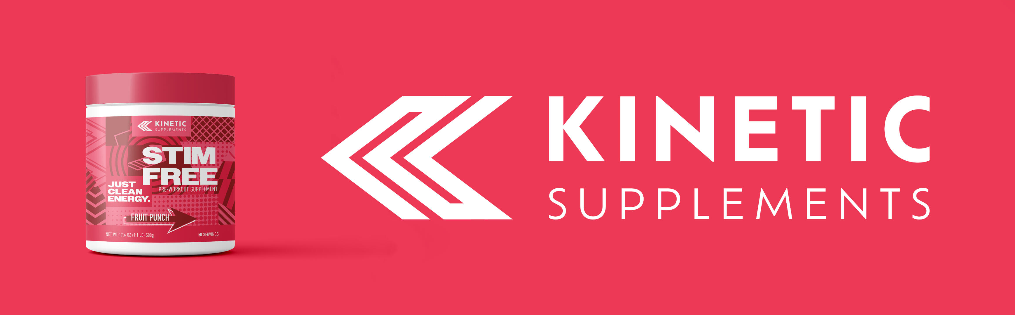
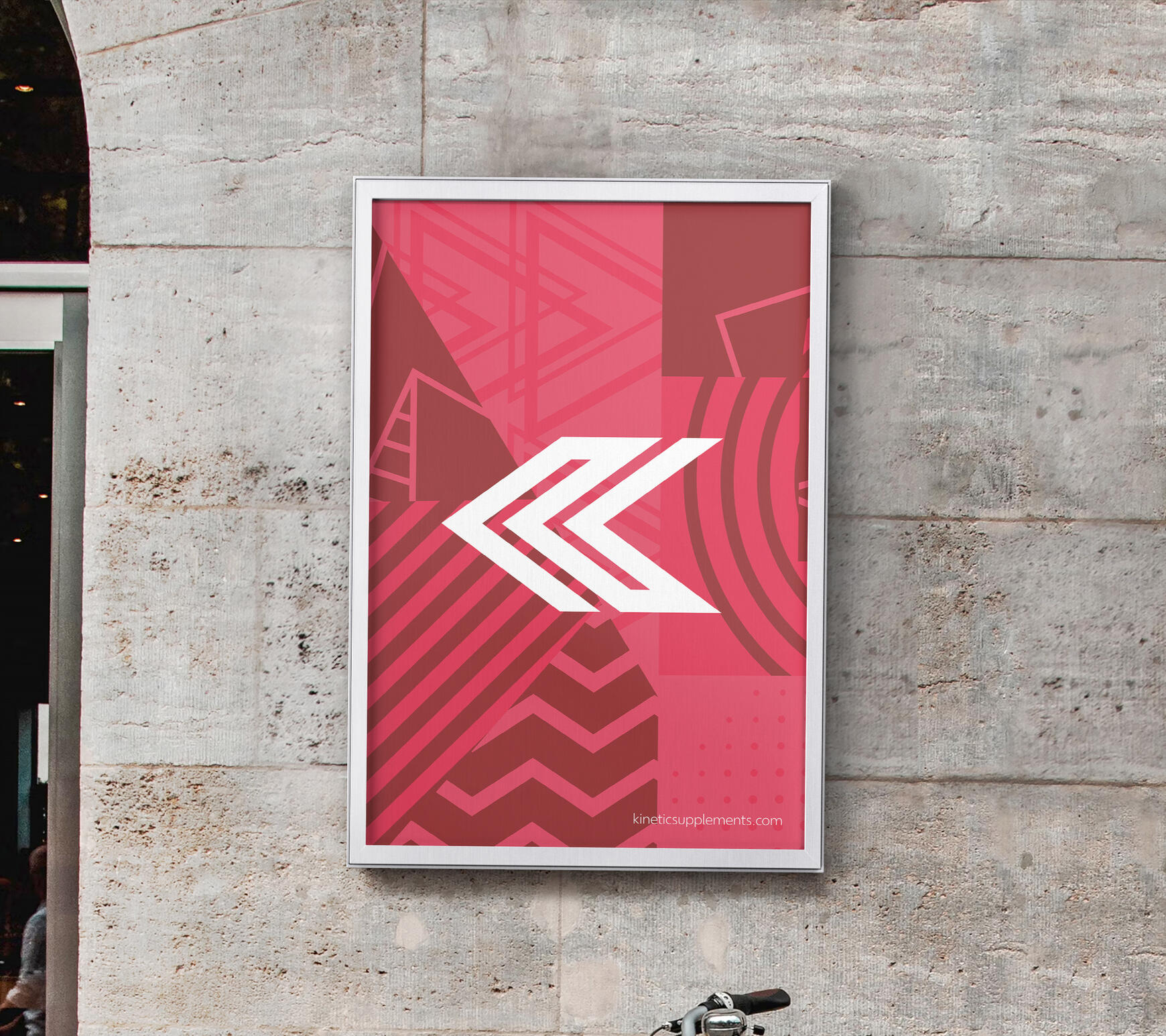
Kinetic Supplements
Brand Identity, Packaging Design
| Objective | Date |
|---|---|
| To create a brand that embodies a feeling of fun and energy that can reach all audiences. | Spring 2024 |

Kinetic Supplements is a pre-workout supplement brand that aims to bring a more casual audience to the world of fitness by straying from the hypermasculine "tough" image that's currently in place.Kinetic's Stim Free pre-workout formula comes in three flavors: Fruit Punch, Blue Razz, and Watermelon.
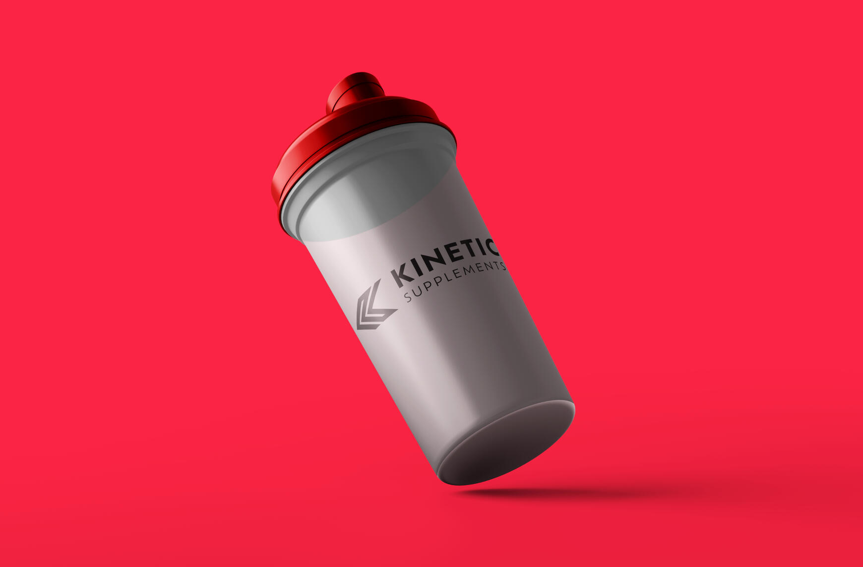
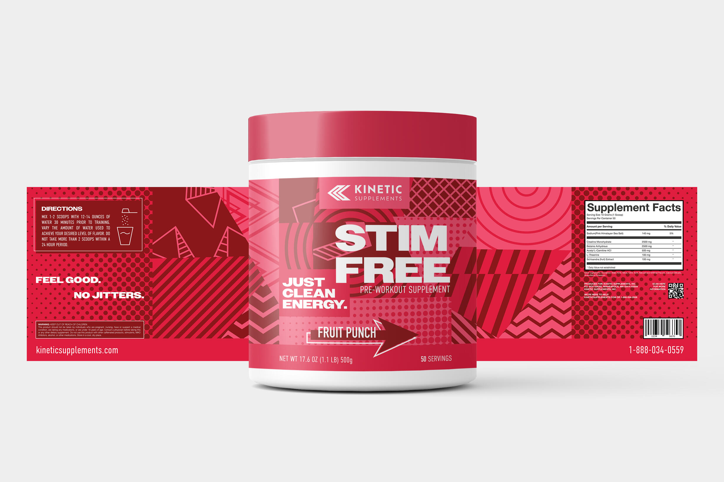


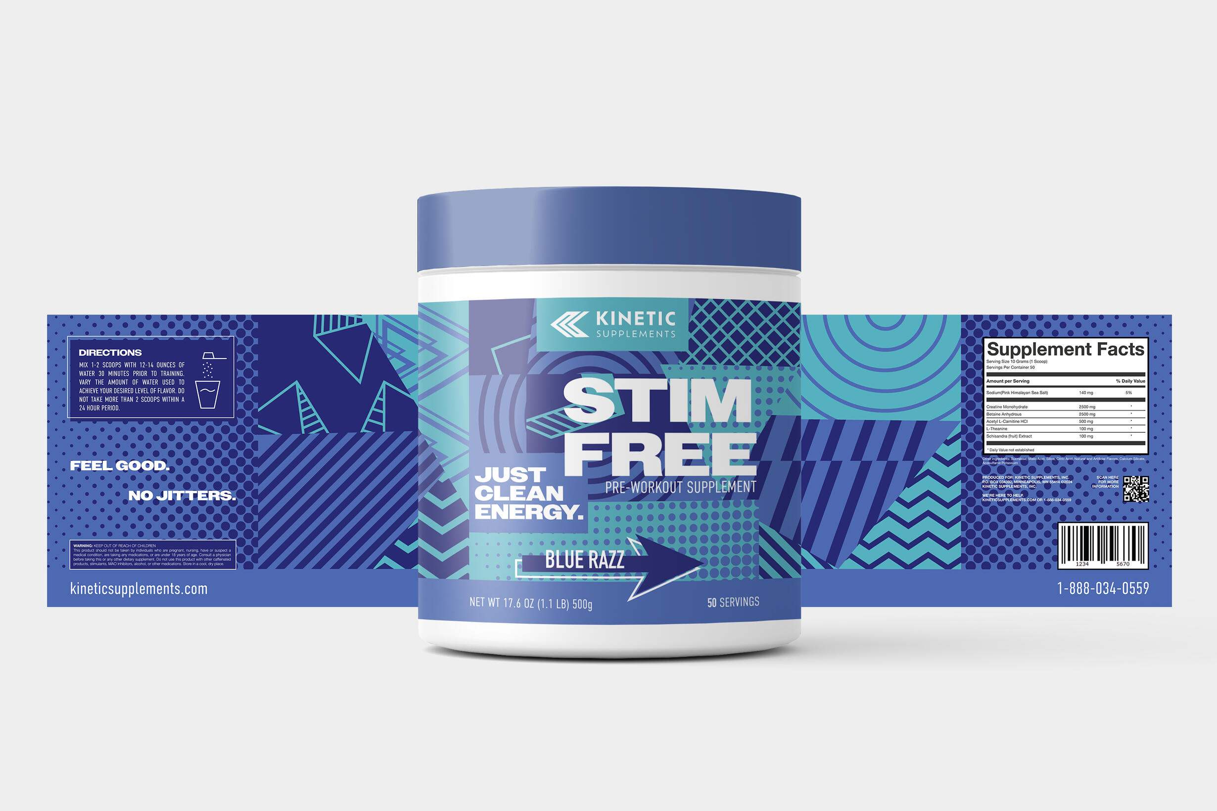
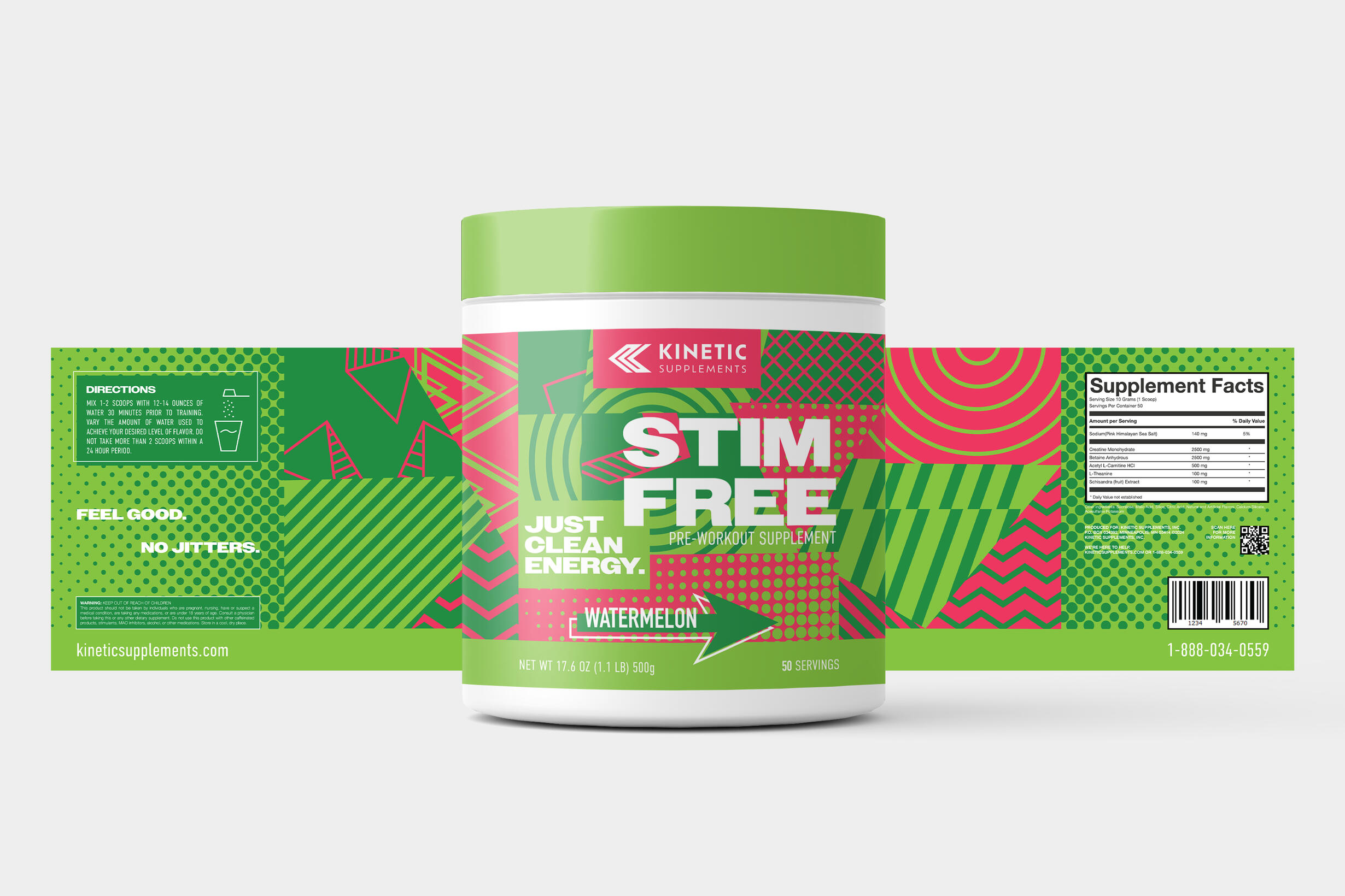
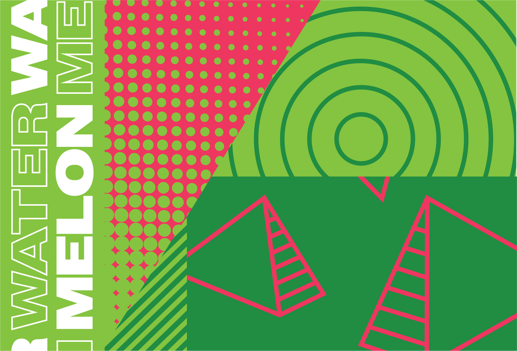

Reflective of the word "kinetic", Kinetic Supplements uses patterns, arrows, and bold colors to convey motion and energy. Red is used as the brand's primary color, as it attracts attention and incites an energetic reaction.Additionally, the primary fonts used are bold and heavy to stand out against the graphic elements.

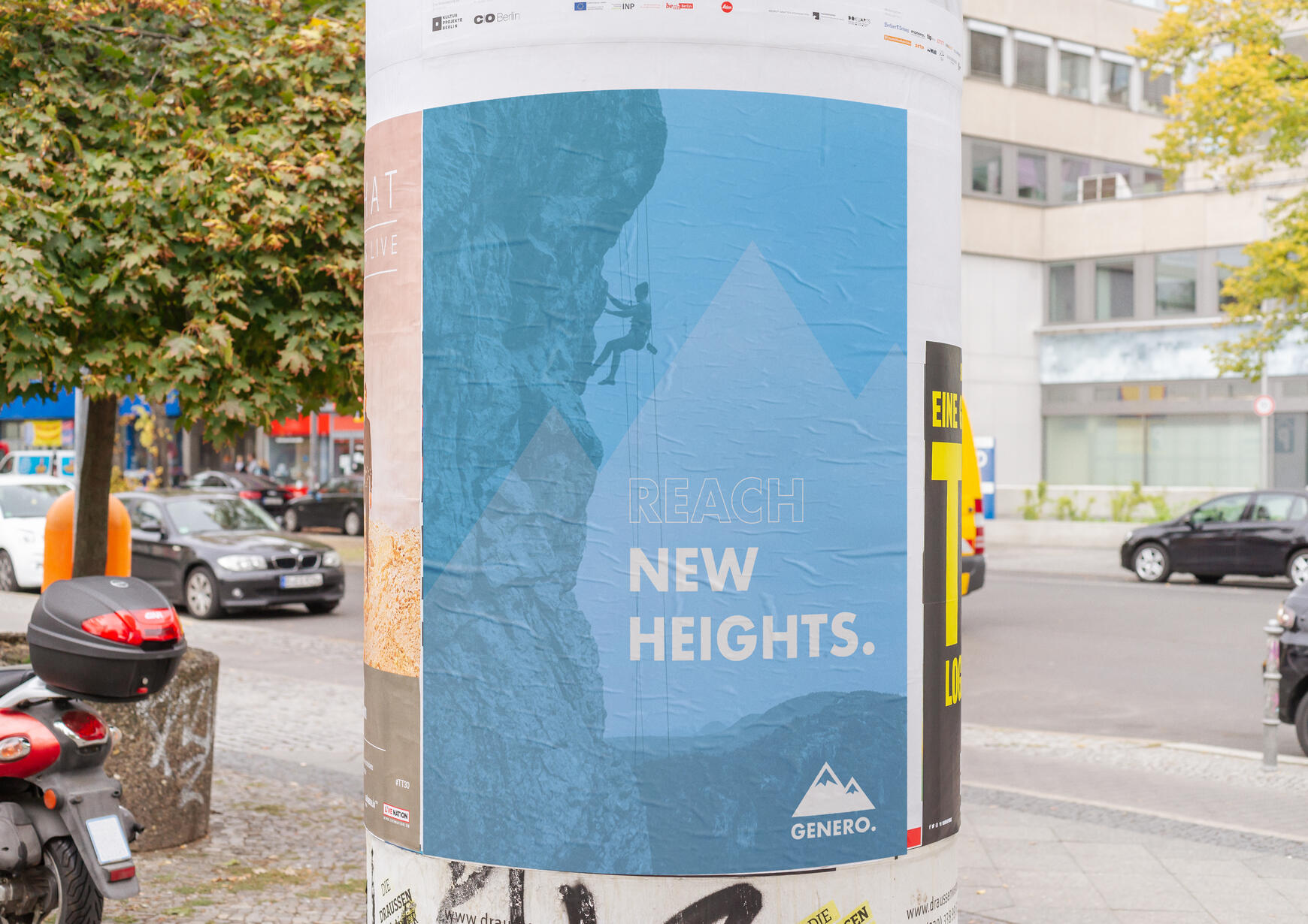
Genero
Brand Identity, Packaging Design
| Objective | Date |
|---|---|
| To create an outdoor recreation brand with a strong identity that translates well across different product types. | Spring 2024 |
Genero is an outdoor recreation brand that has a focus on camping and rock climbing. It aims to reach wider audiences than other brands through its approachable yet effective packaging and branding style.Genero offers several different products, ranging all the way from water bottles to climbing shoes.
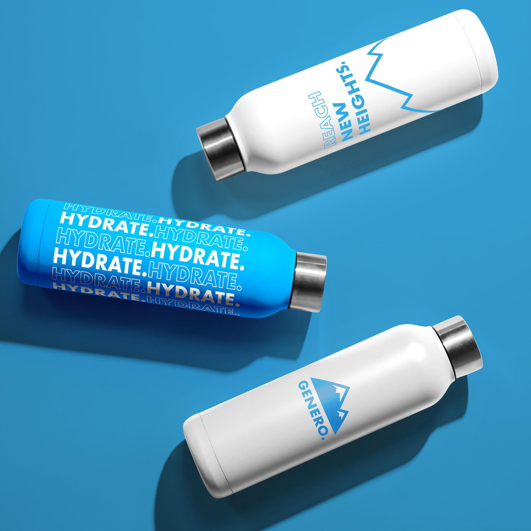
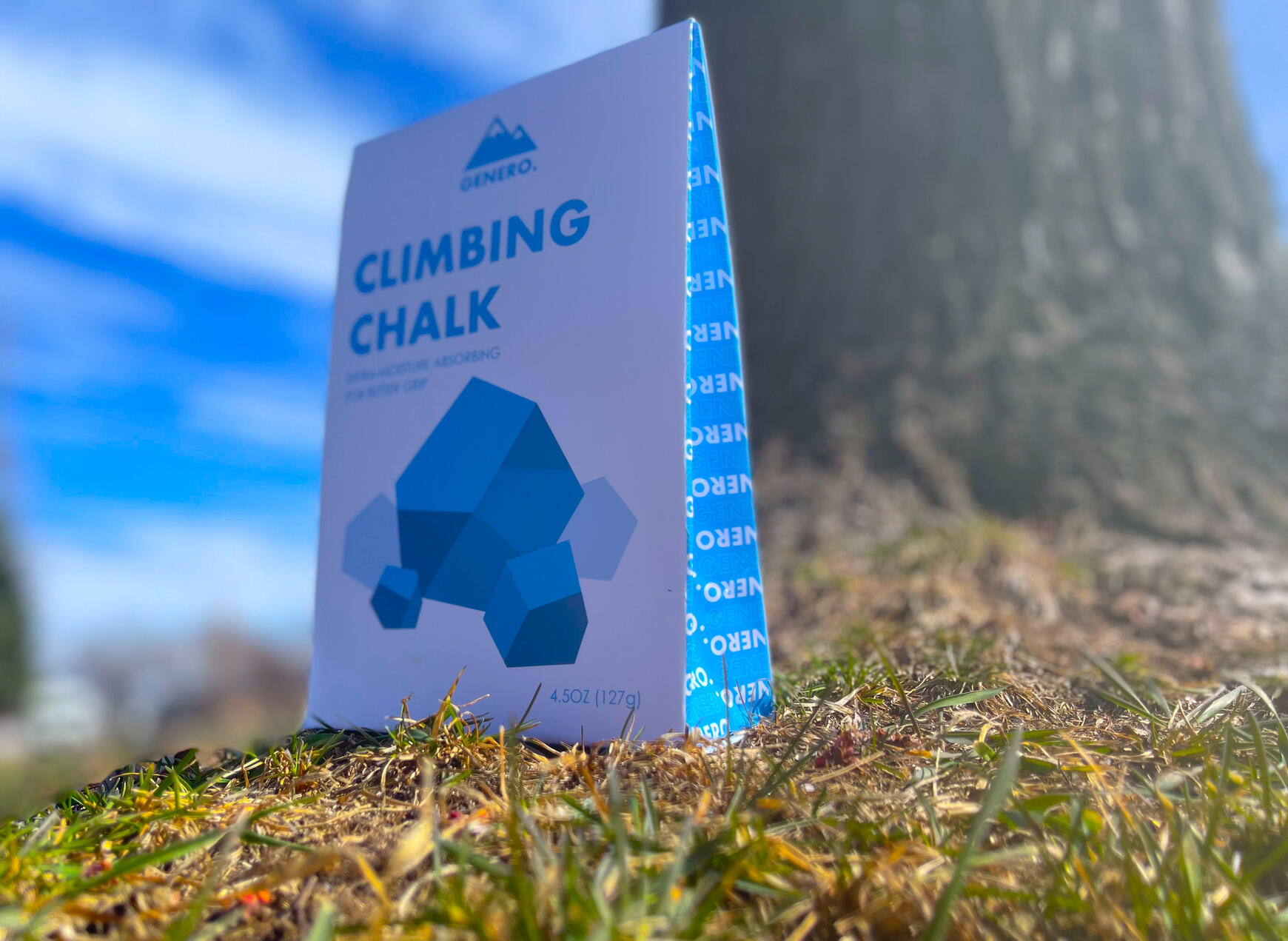
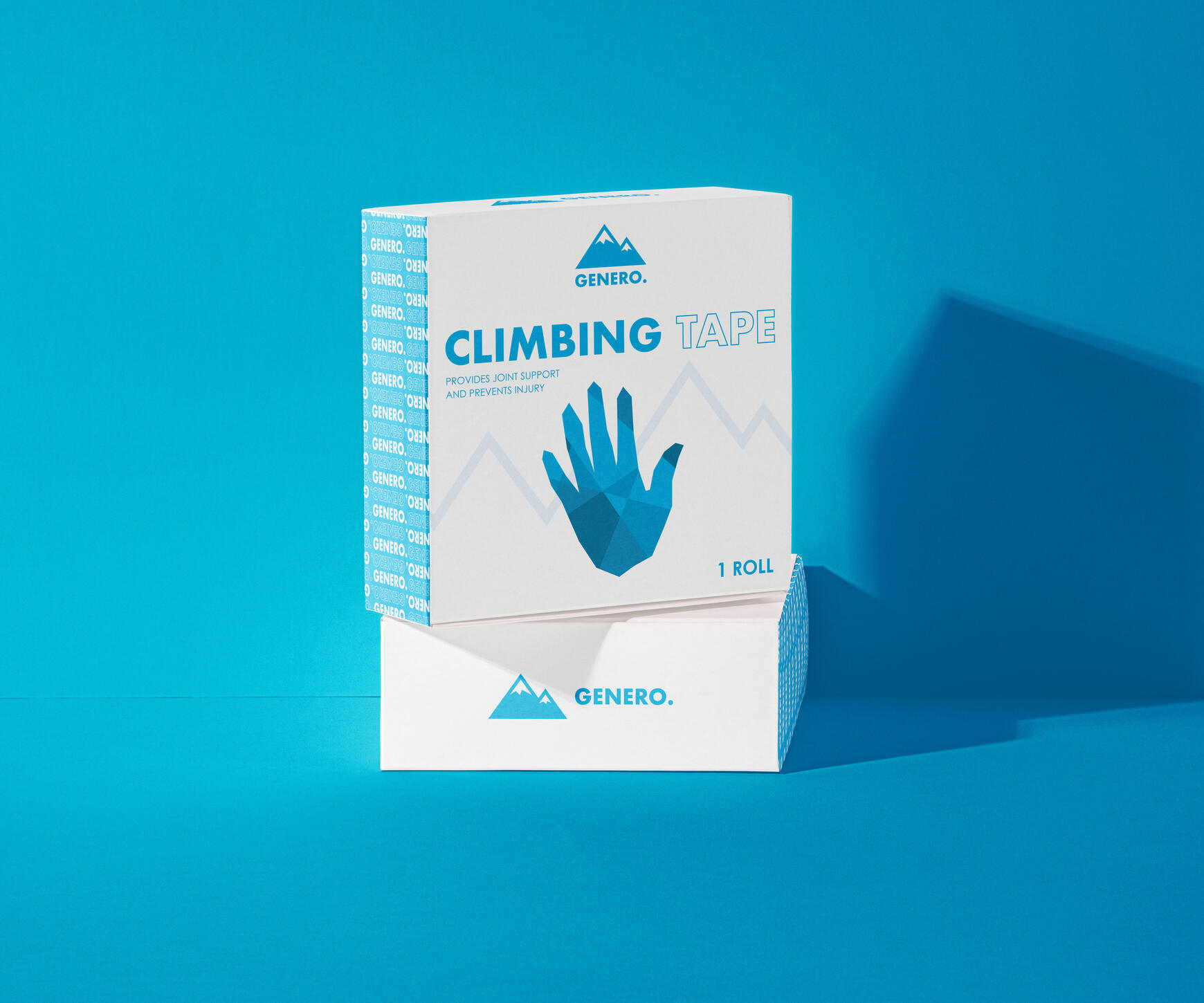
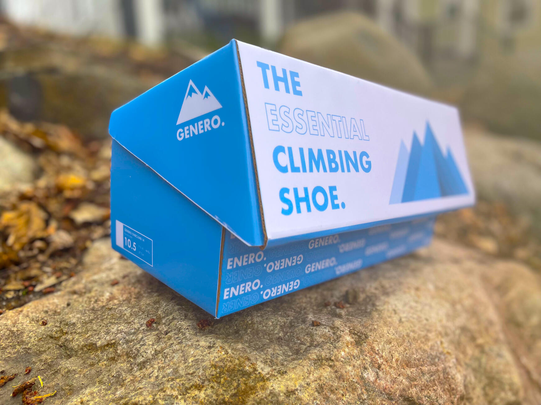


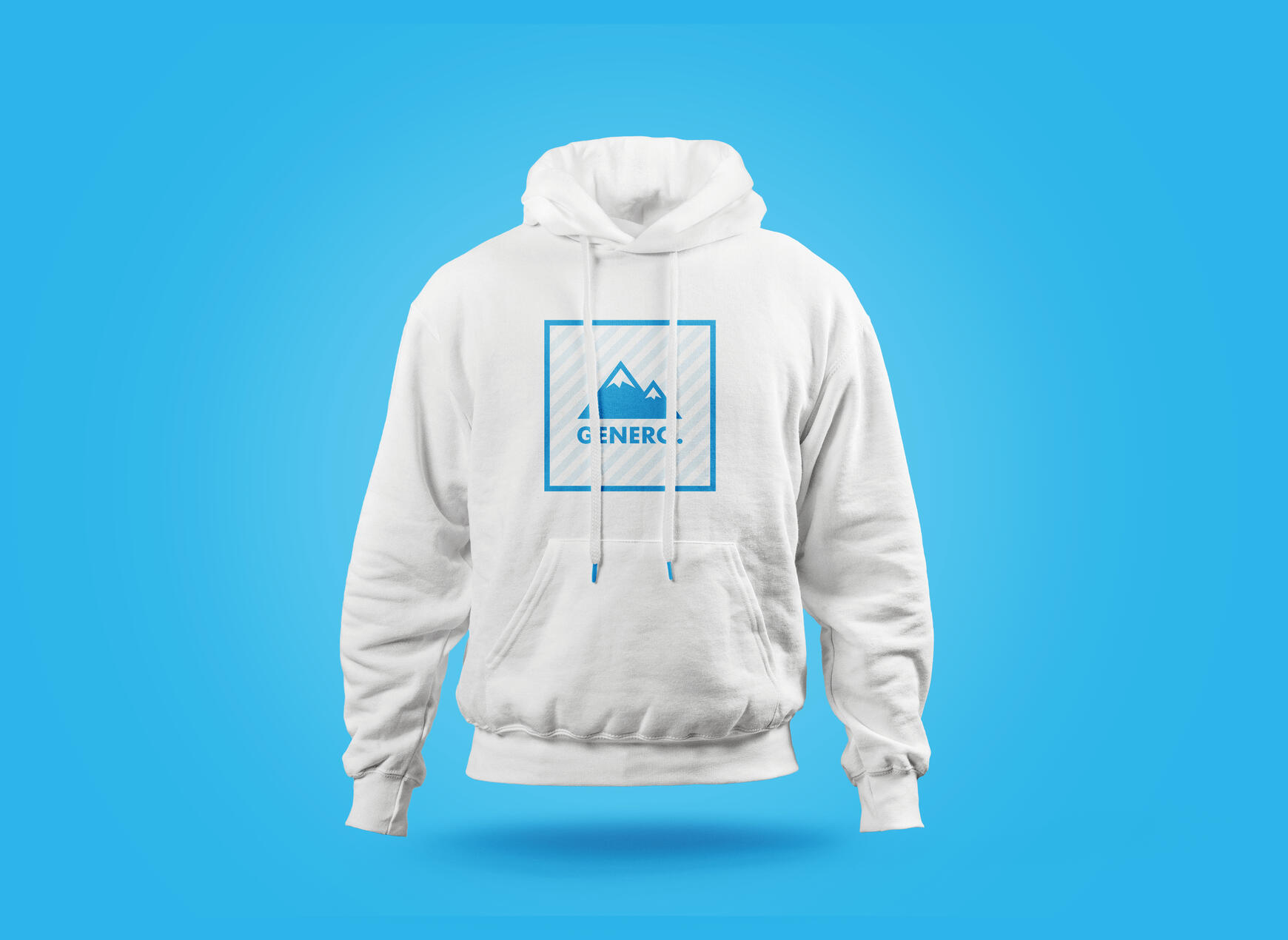
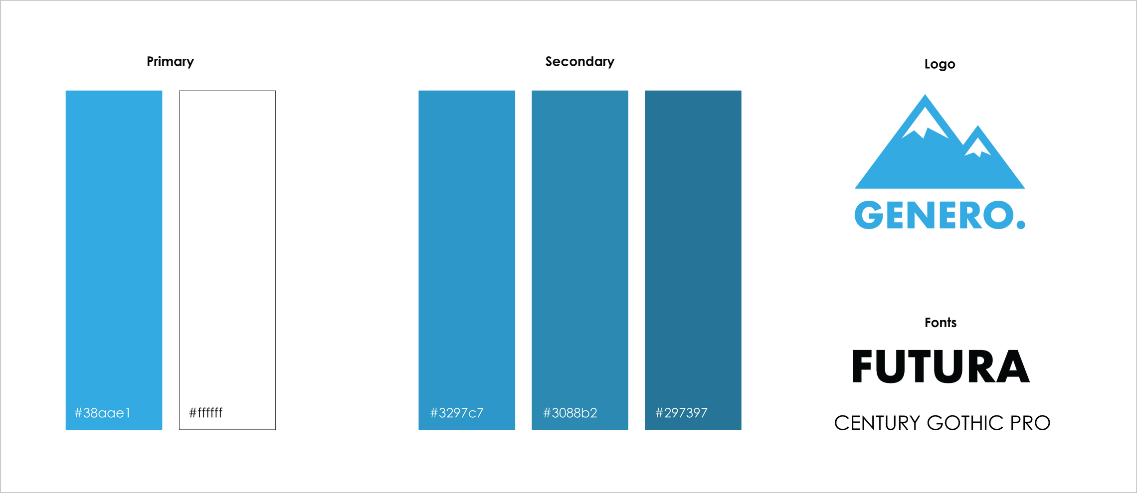
Reflective of its target market, Genero utilizes outdoor imagery, particularly mountains, to convey the idea of rock climbing and activity.These visual elements are combined with geometric and bold fonts in order to create a modern, trendy style. This helps the brand to reach markets beyond hardcore campers and climbers.

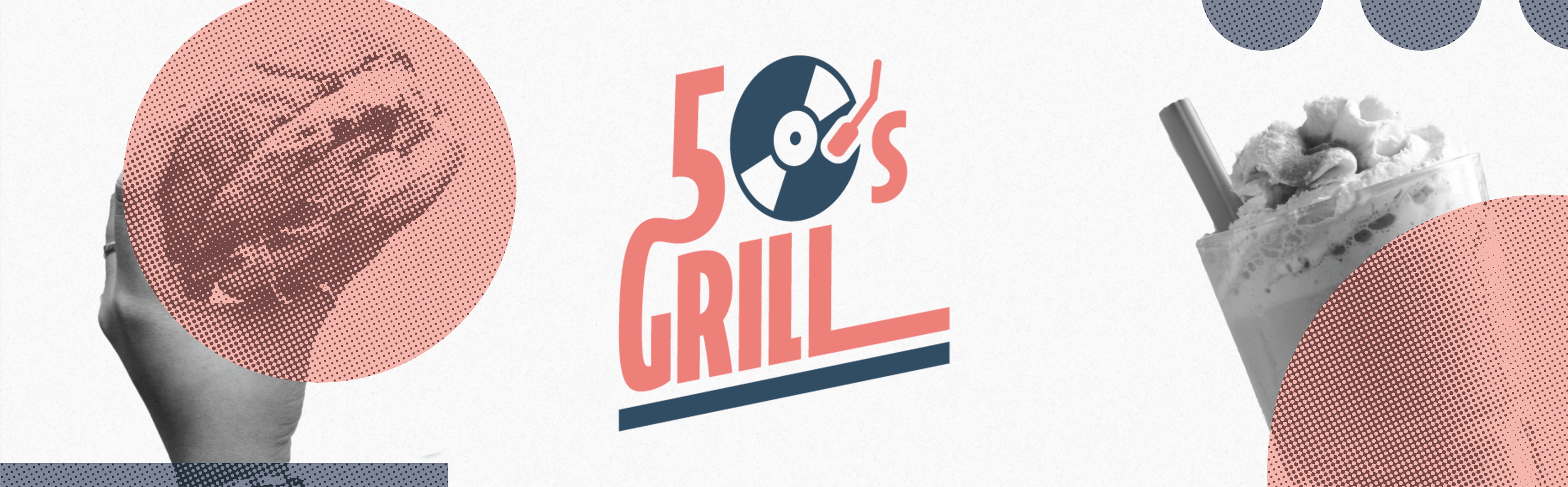
50's Grill
Rebrand
| Objective | Date |
|---|---|
| To give a local restaurant a brand refresh in order to attract a wider range of customers. | Spring 2024 |
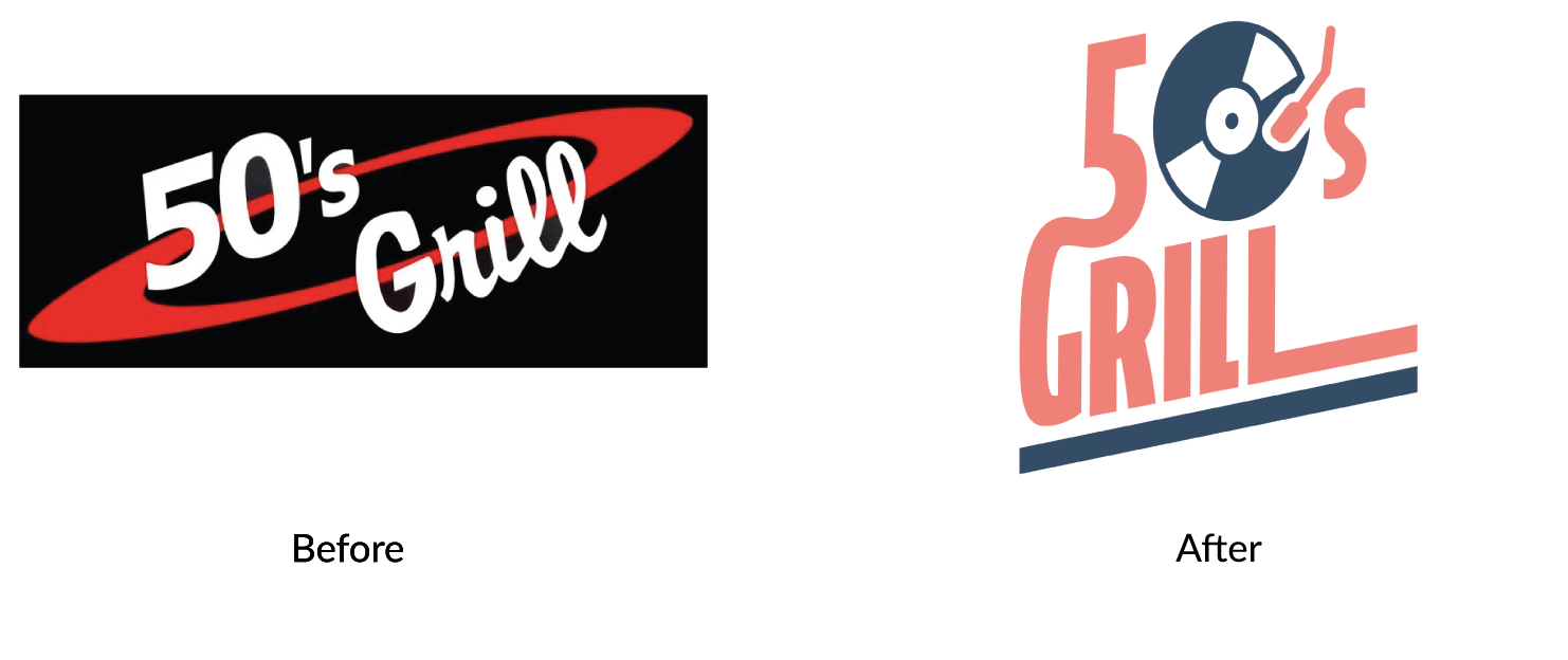
50's Grill is a 1950's diner-themed restaurant located in Brooklyn Center, MN. They offer an immersive atmosphere and nostalgic food that aims to bring a piece of history to the modern day.Though they are a local restaurant, they aim to reach an audience beyond just Brooklyn Center residents.
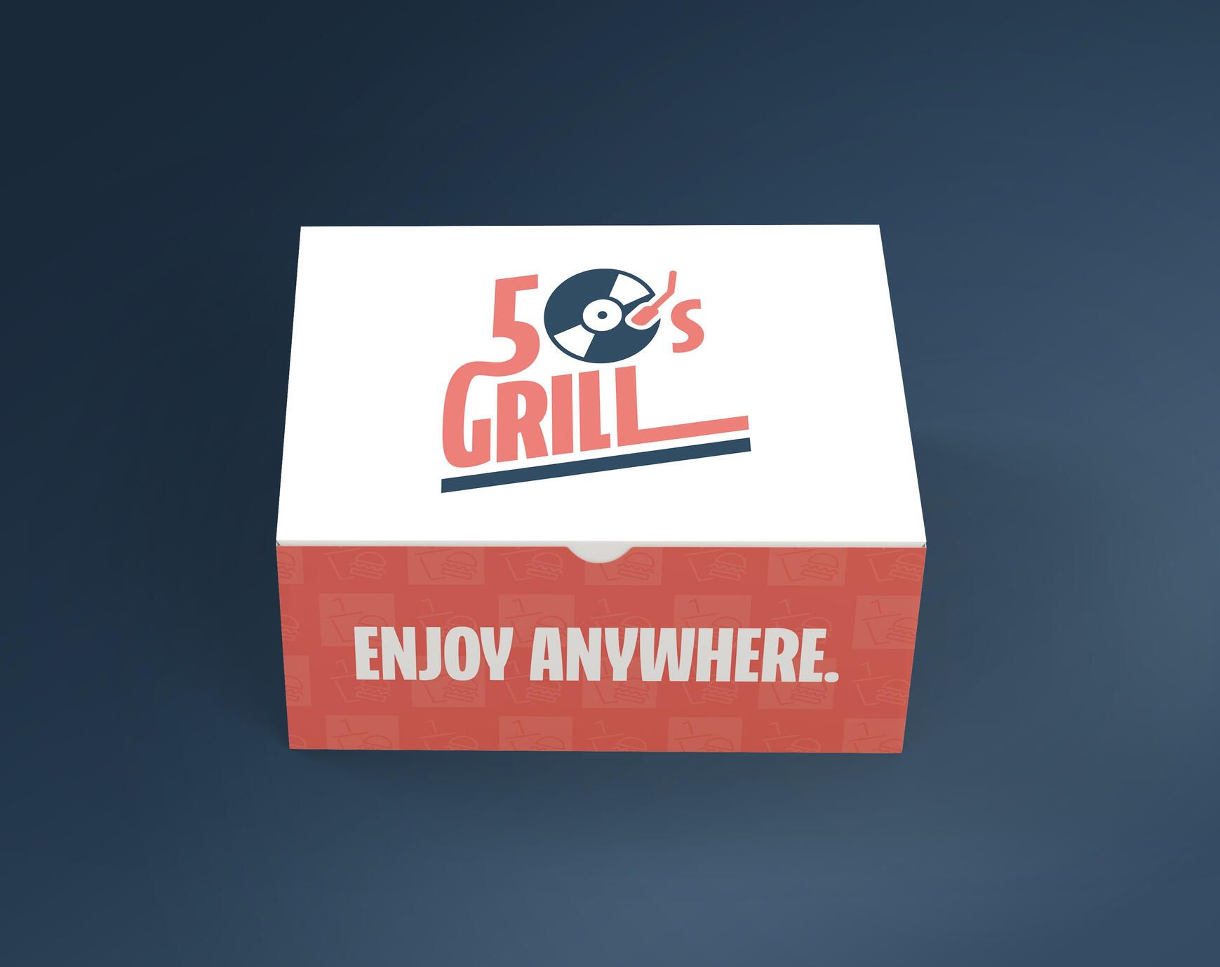
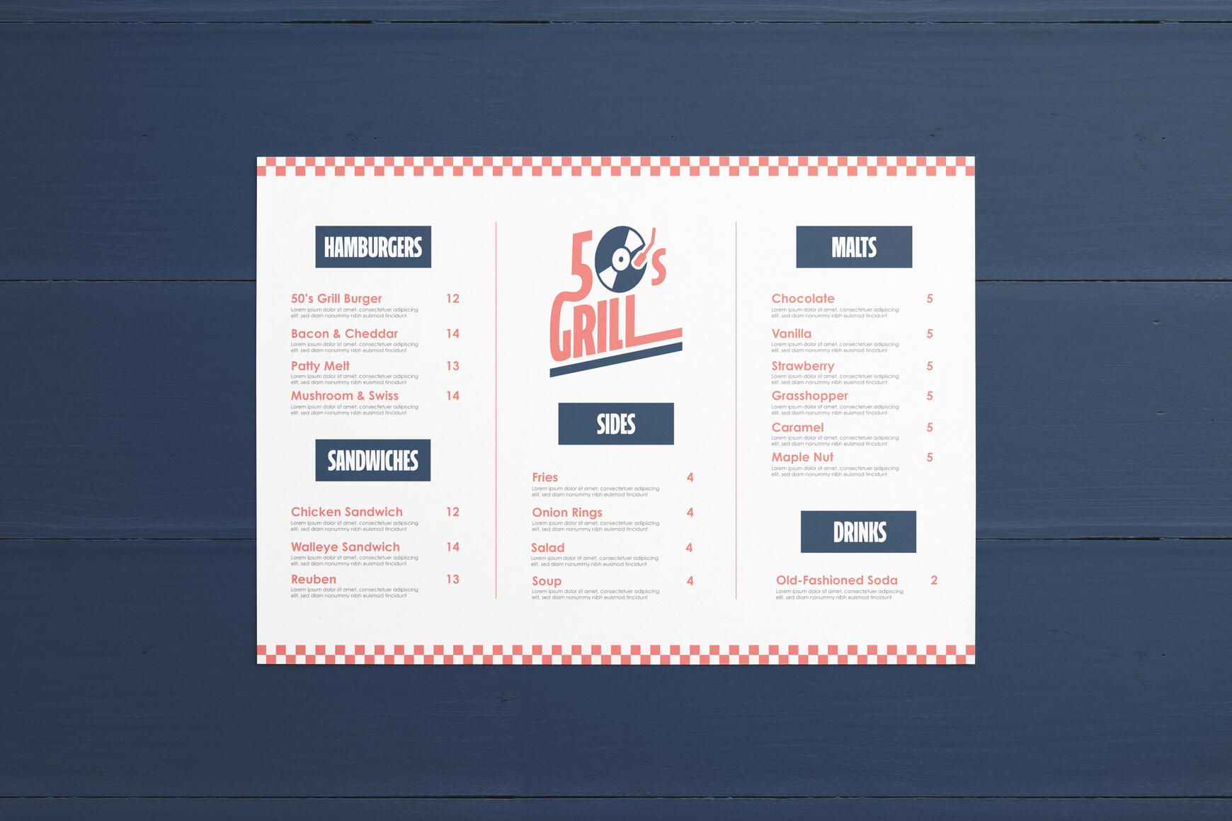
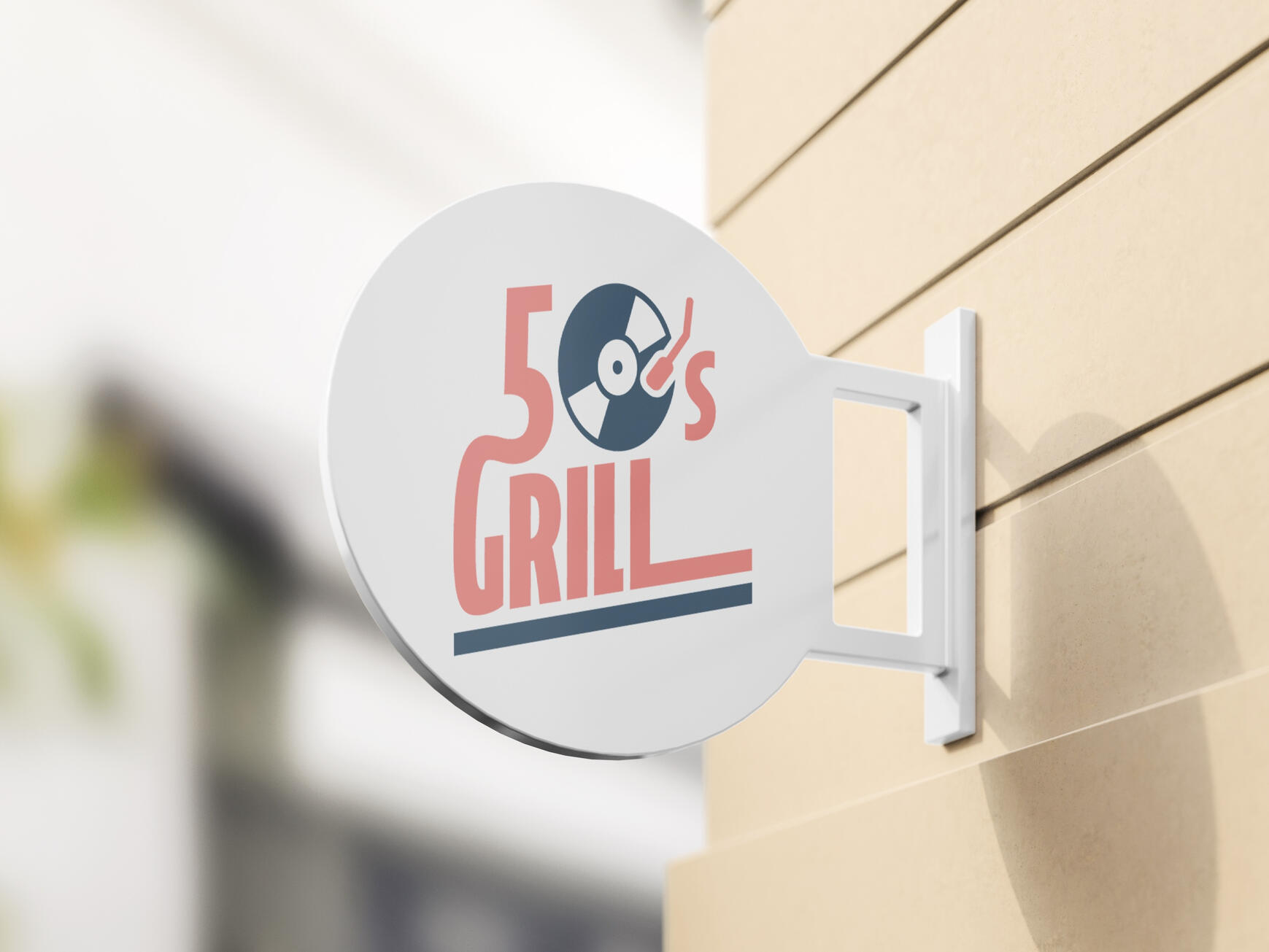
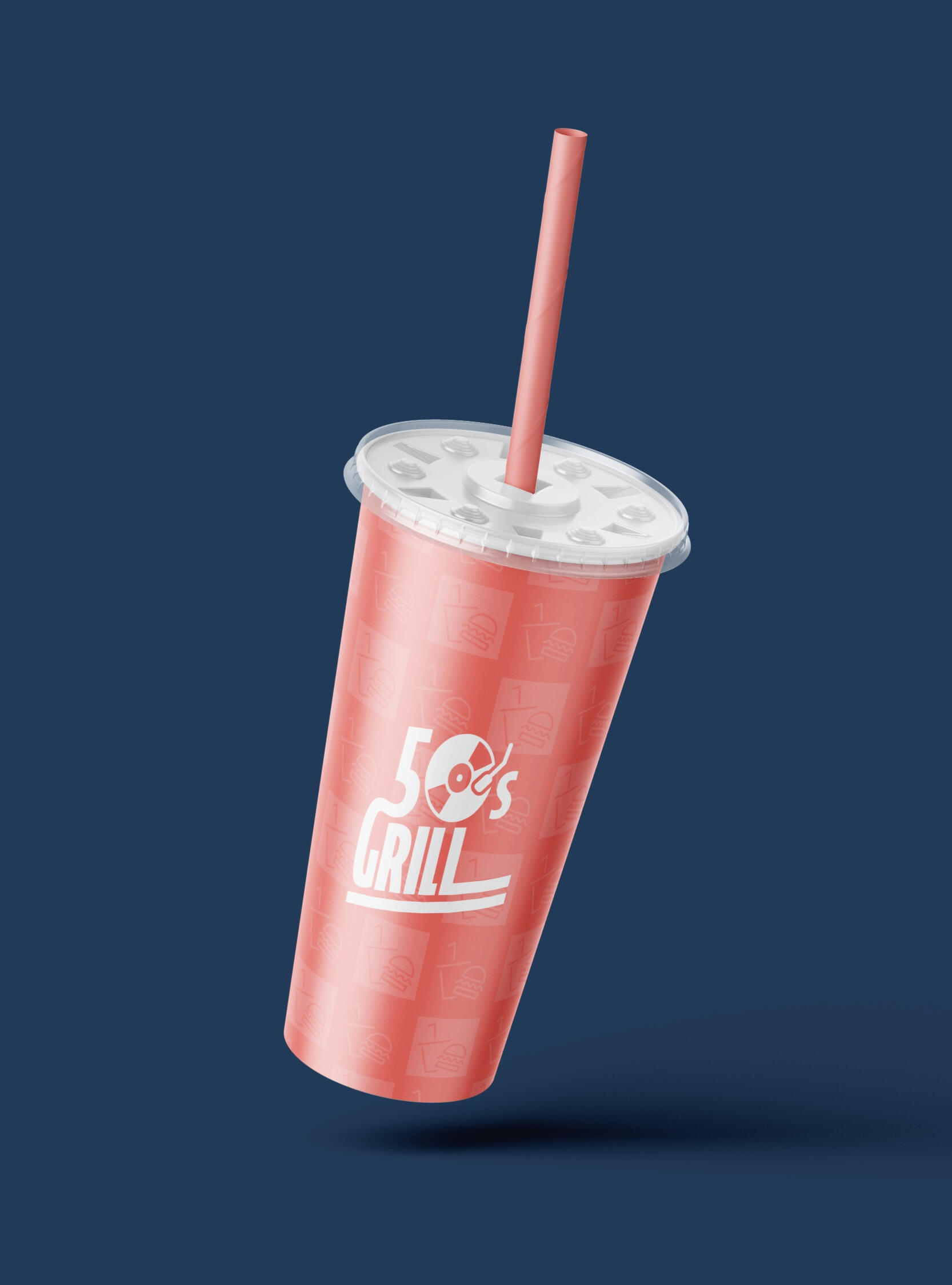
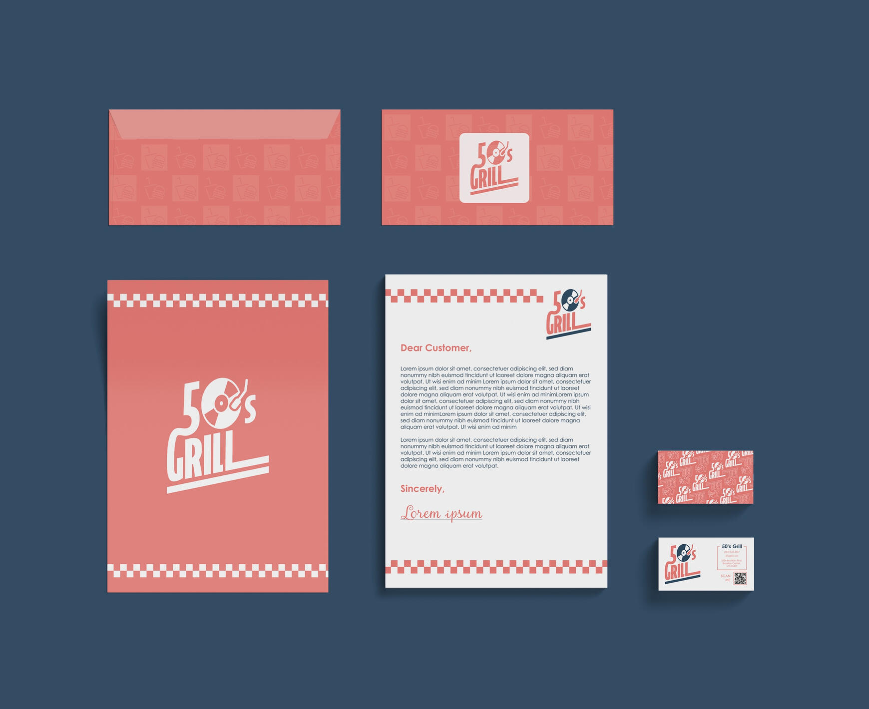
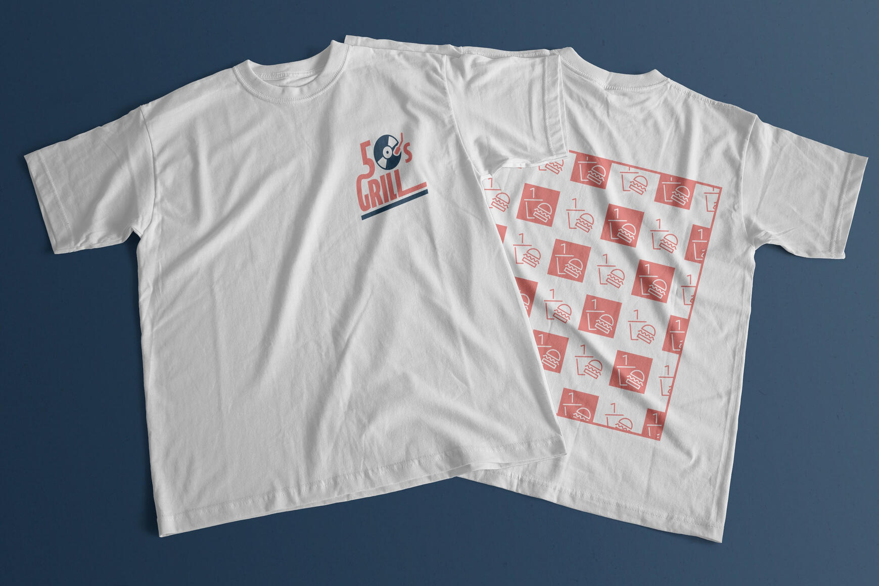
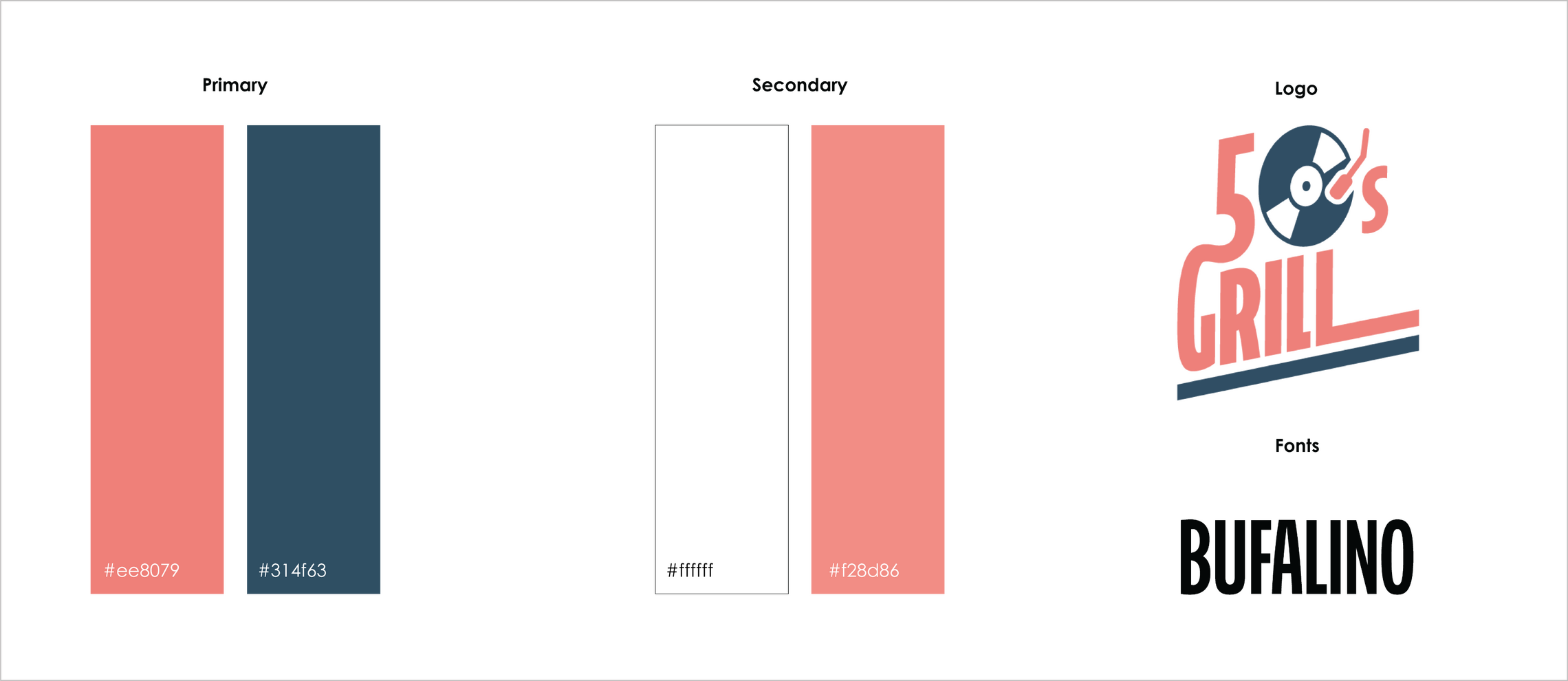
50's Grill combines nostalgic elements, such as checker patterns and vinyl records, with modern shapes and colors to create a unique identity that utilizes the best of both worlds.
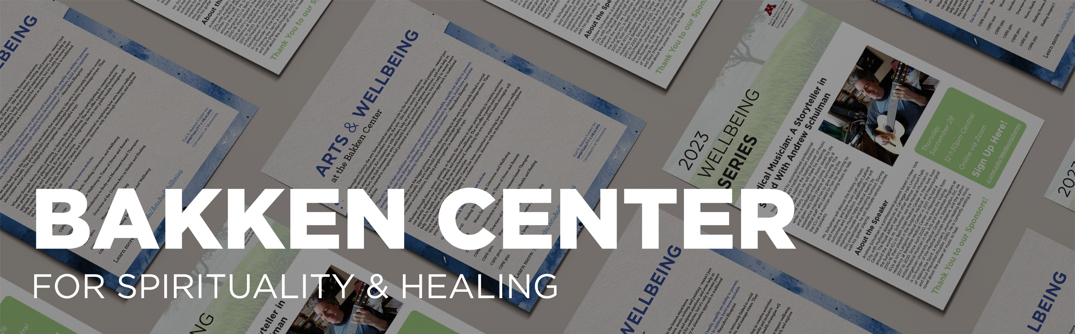
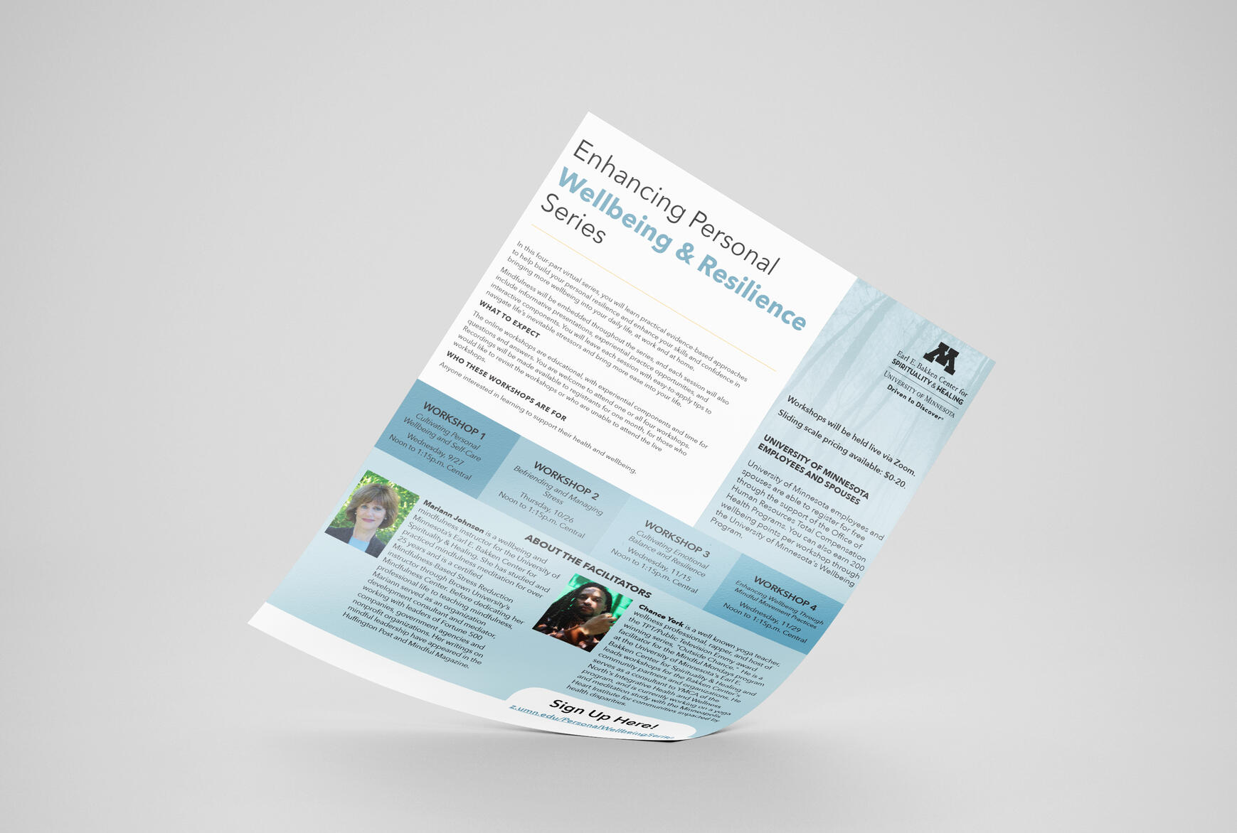
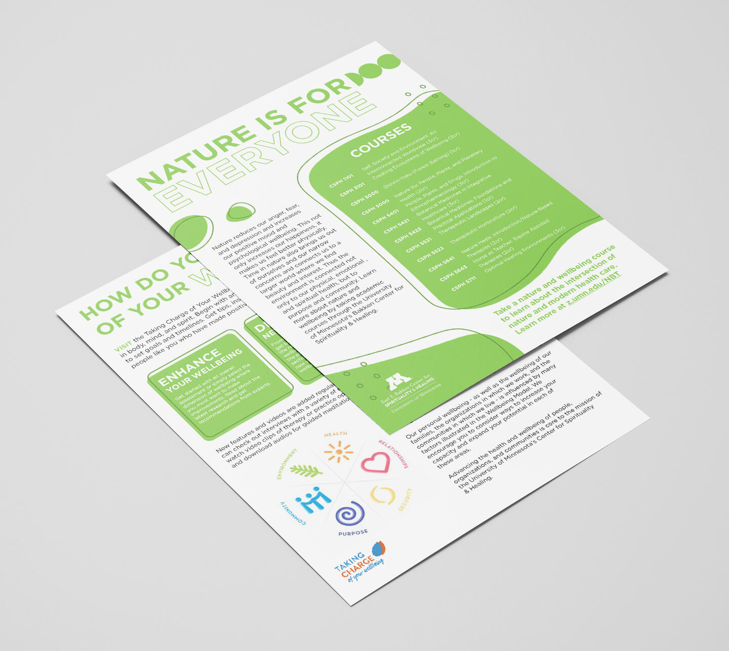
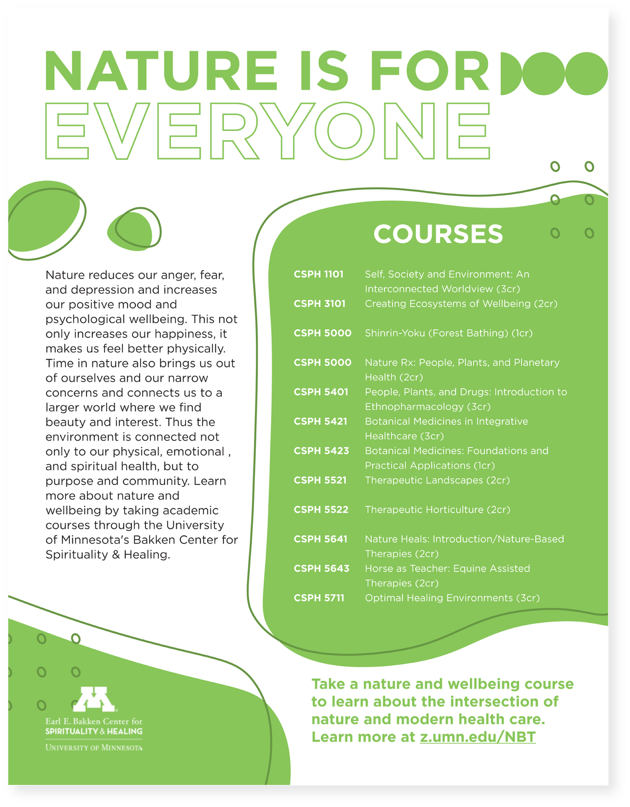
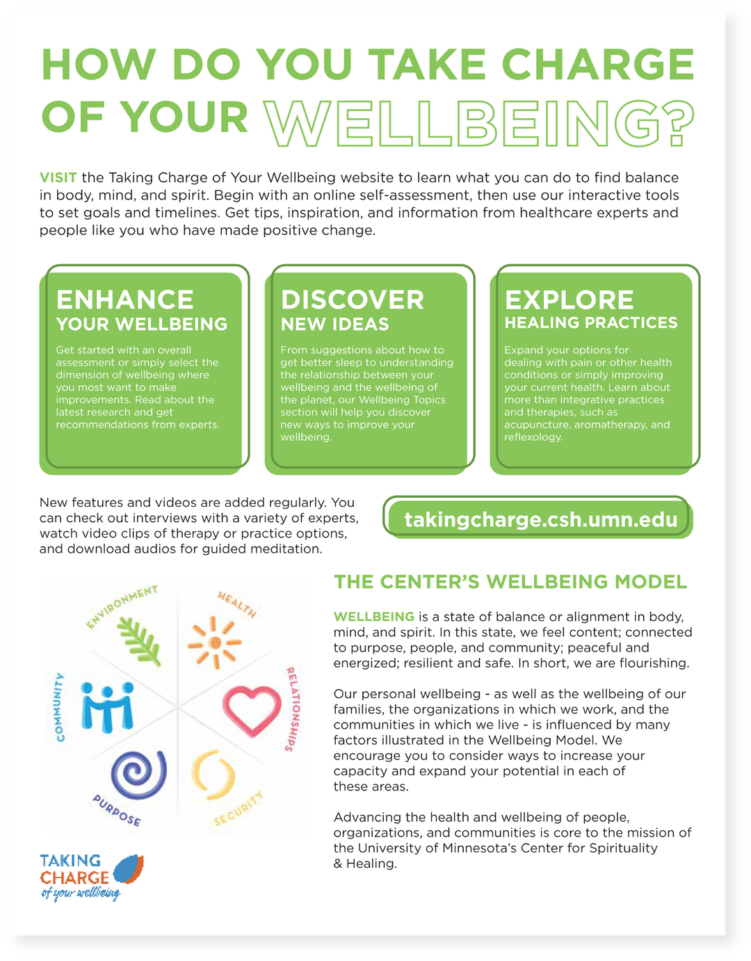
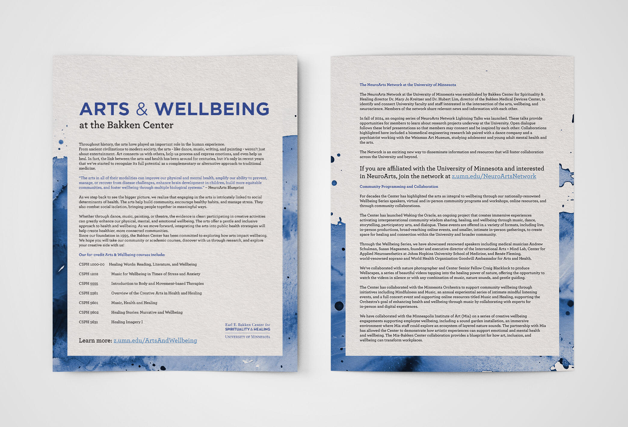
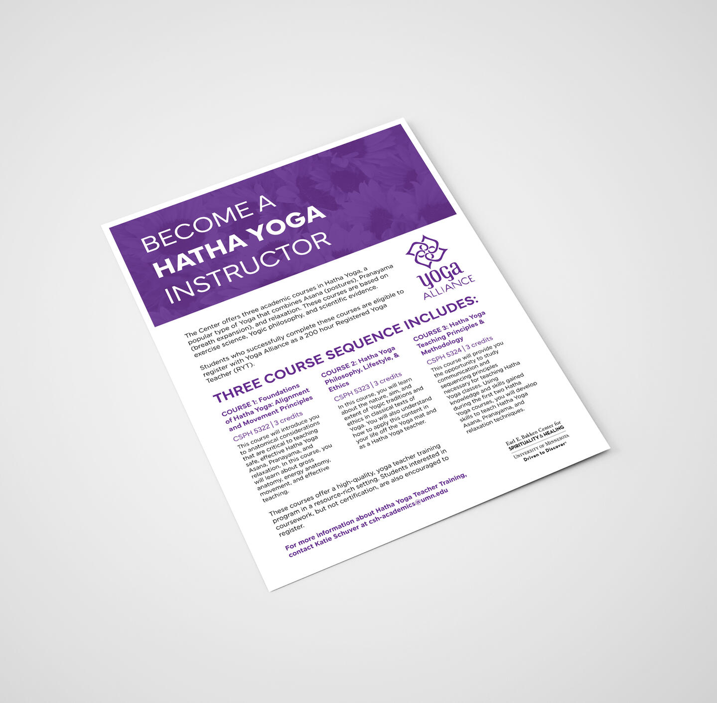
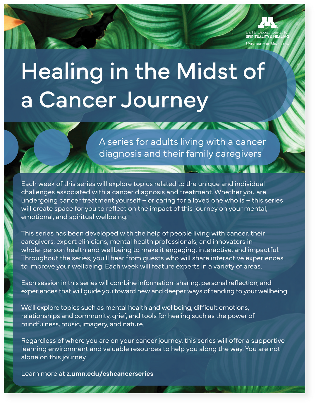
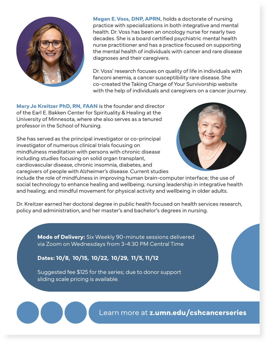
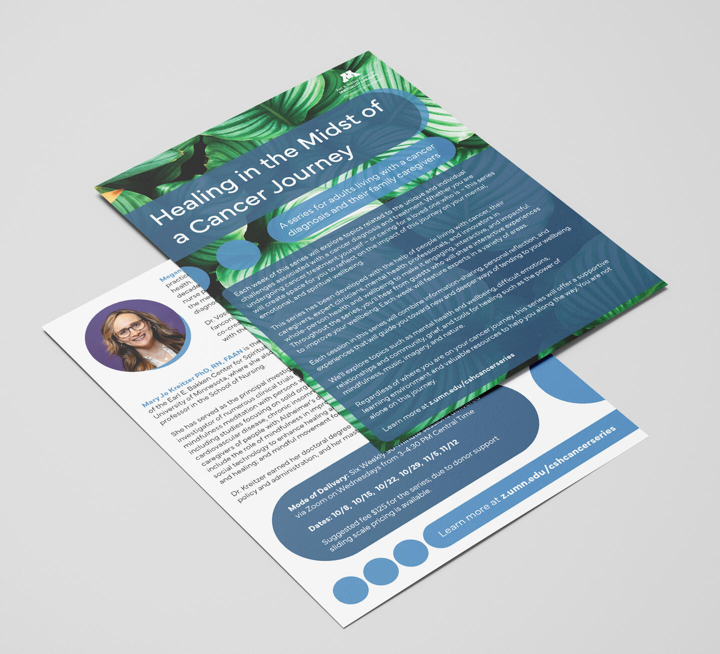
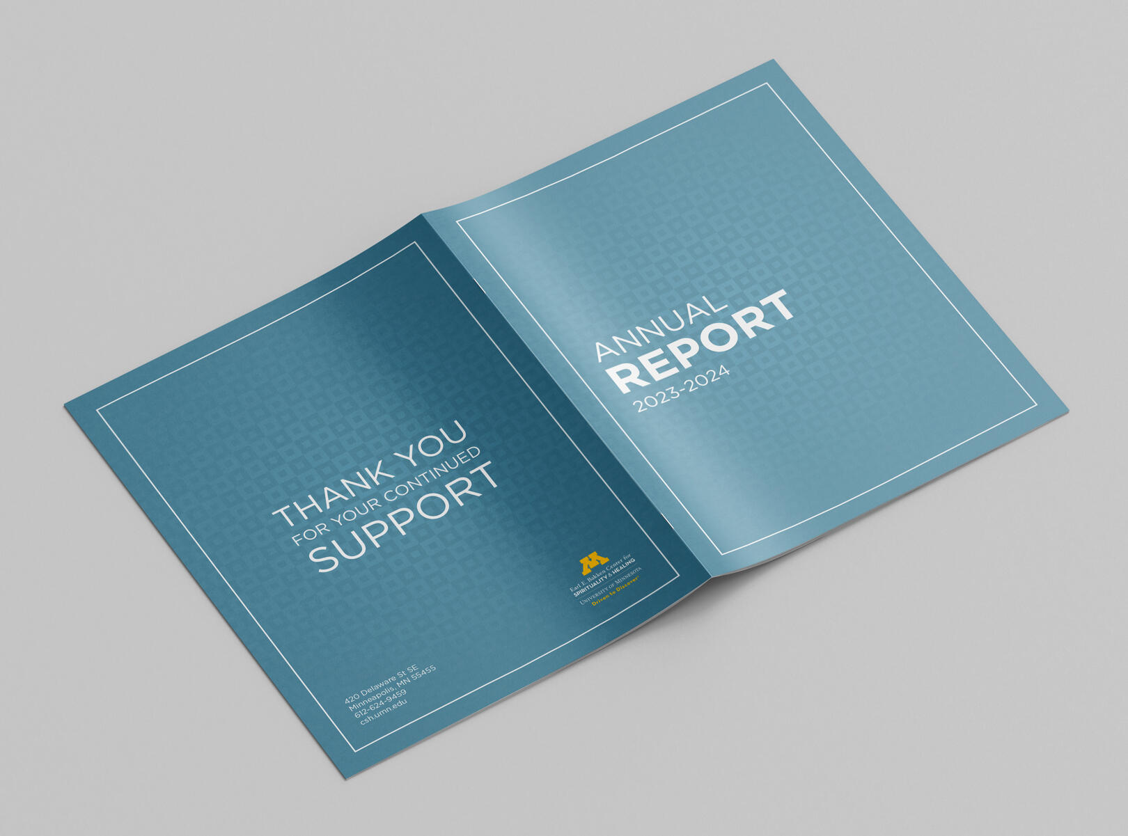
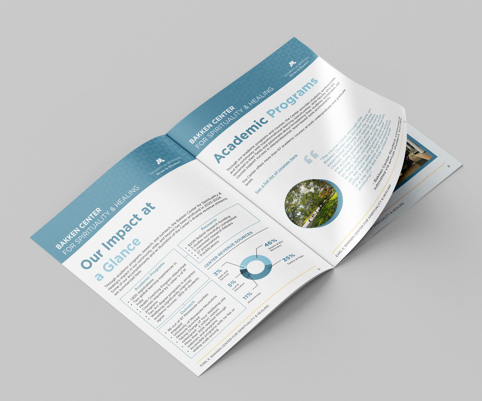
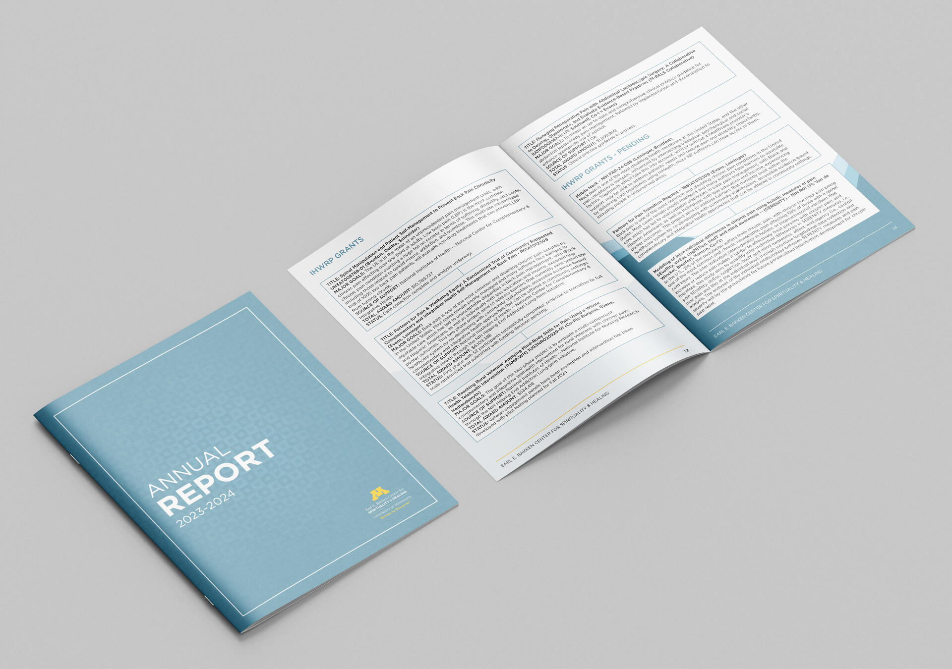
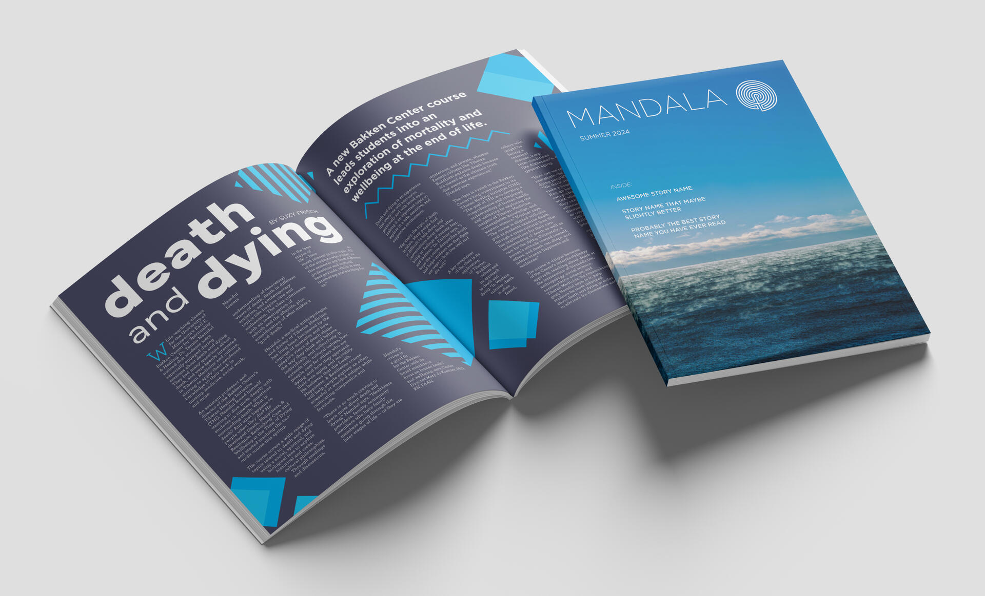
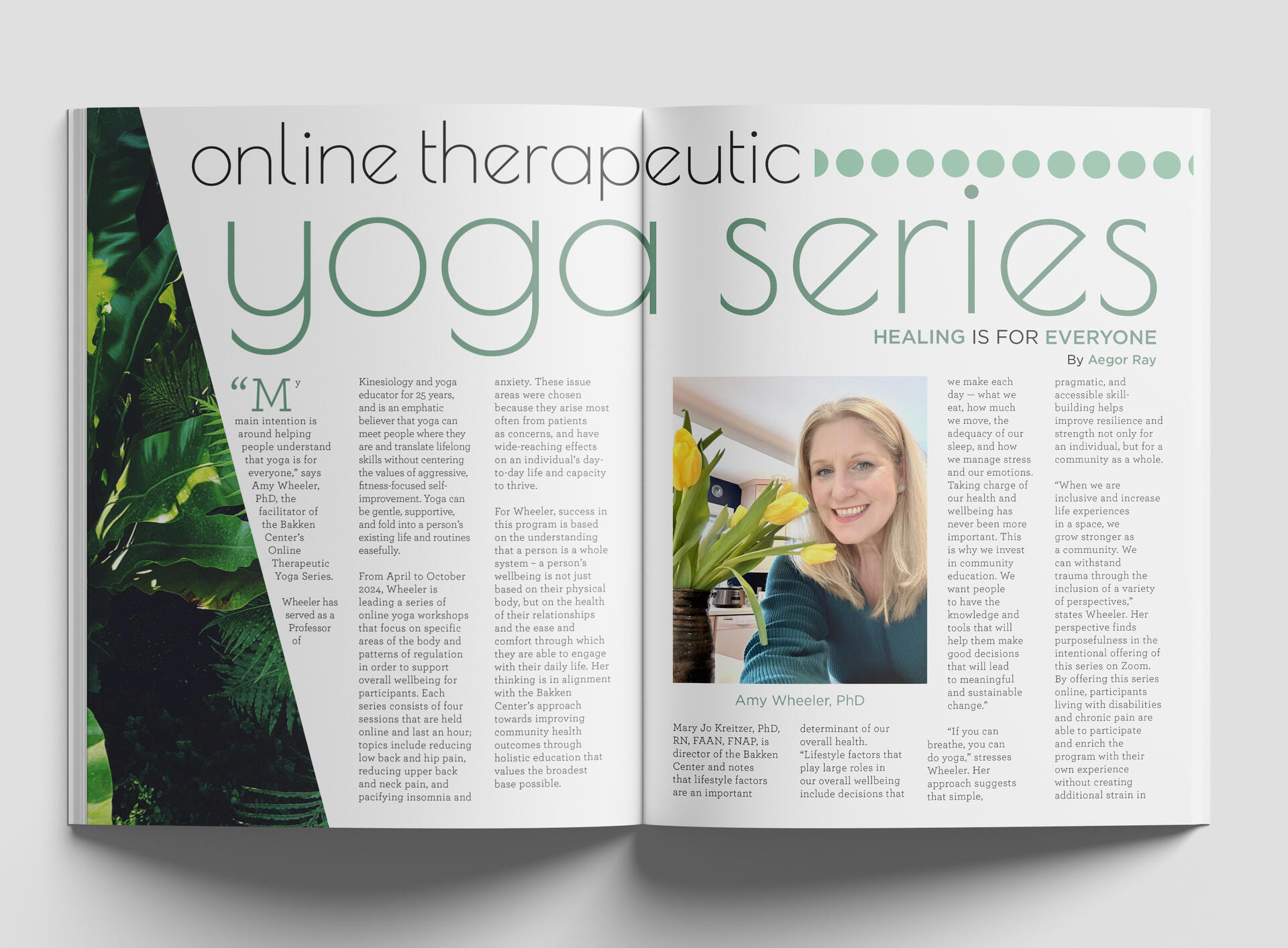
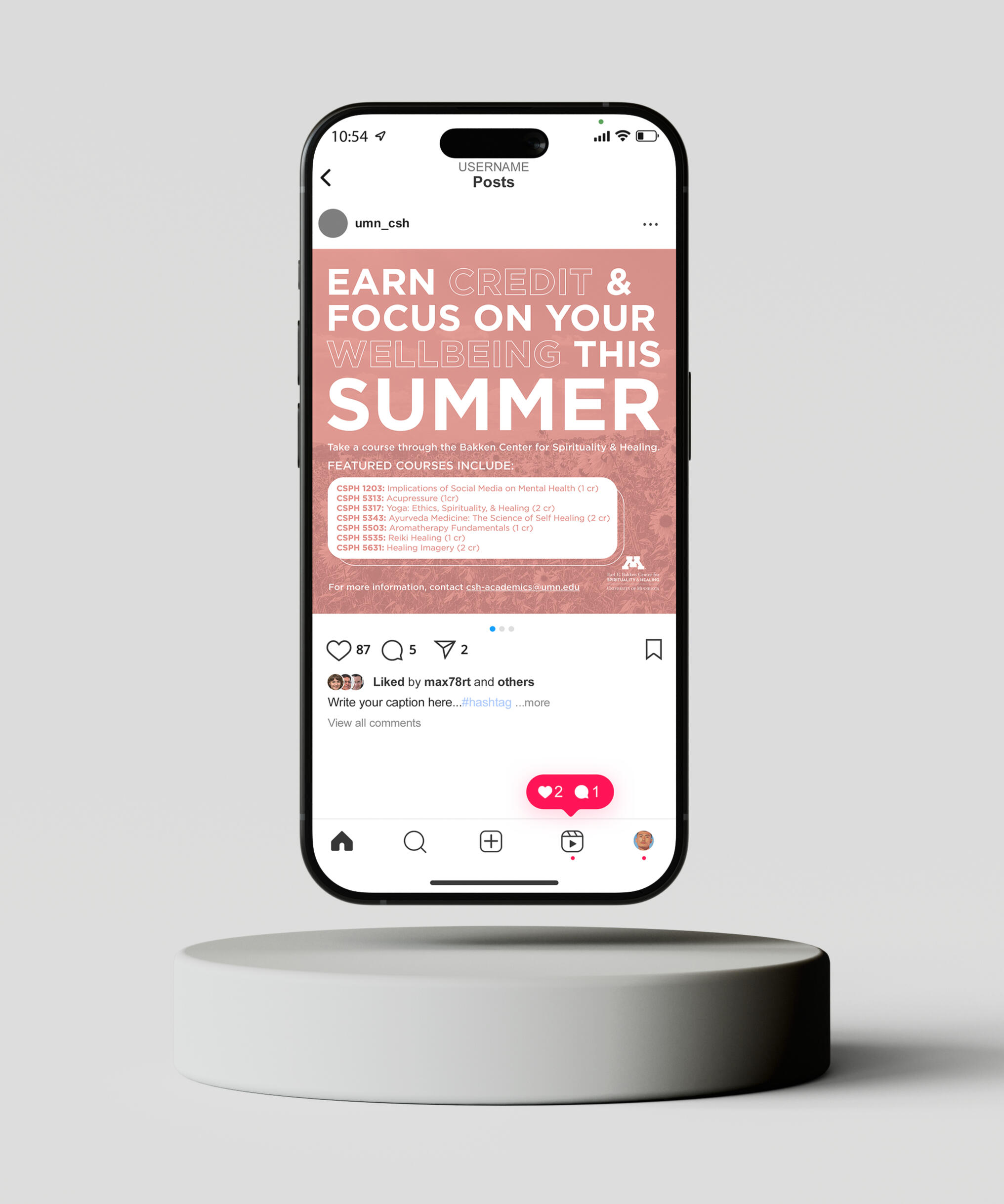
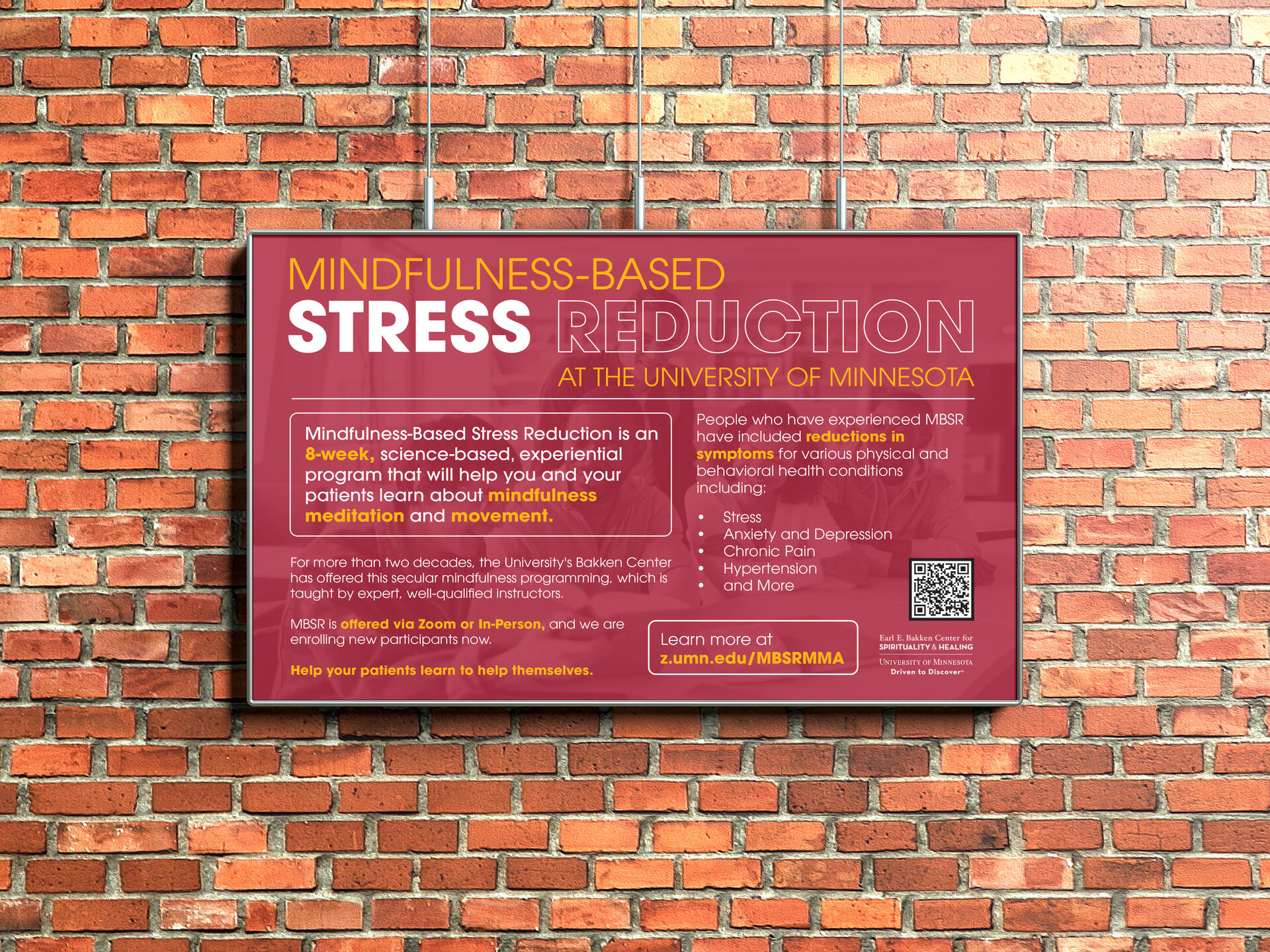
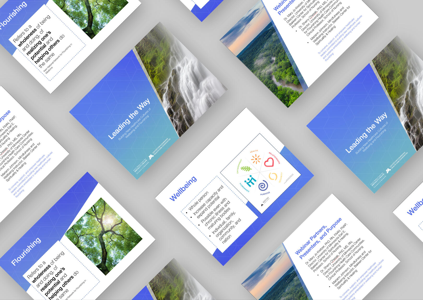
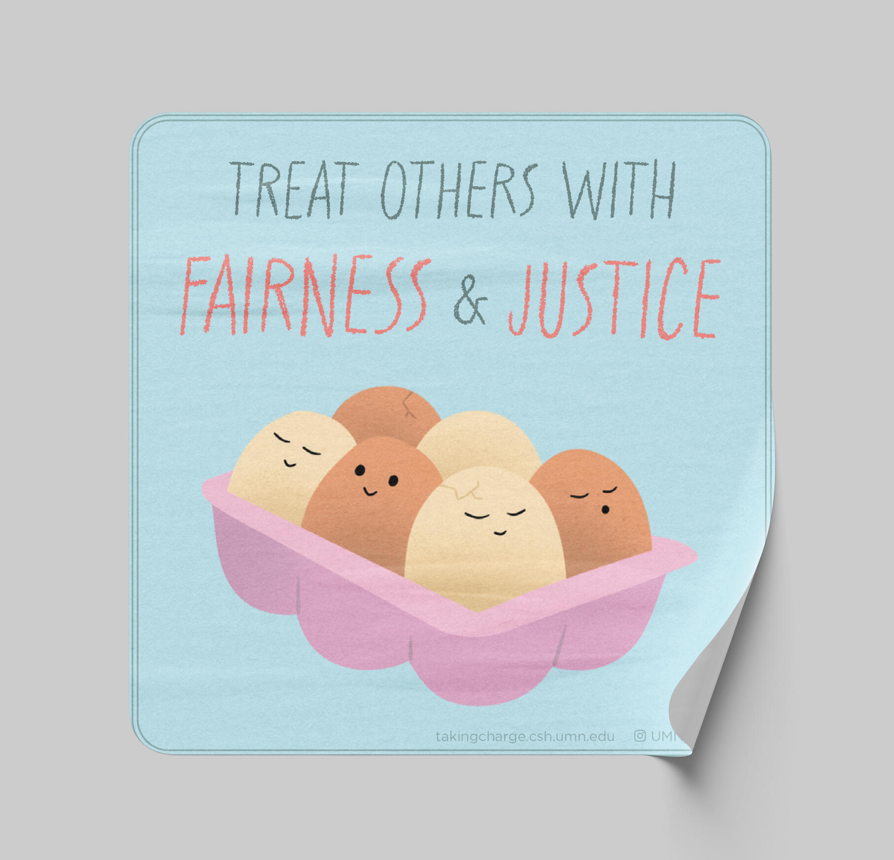
Bakken Center
Flyer Designs and Layouts
| Objective | Date |
|---|---|
| To create course flyers and brand collateral for wellness programs that are welcoming and accessible to the community. | May 2023 – May 2025 |
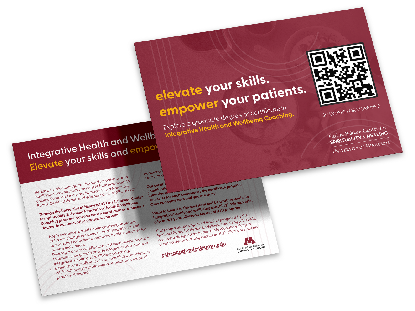
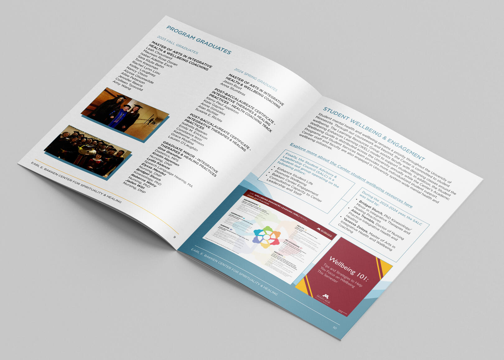
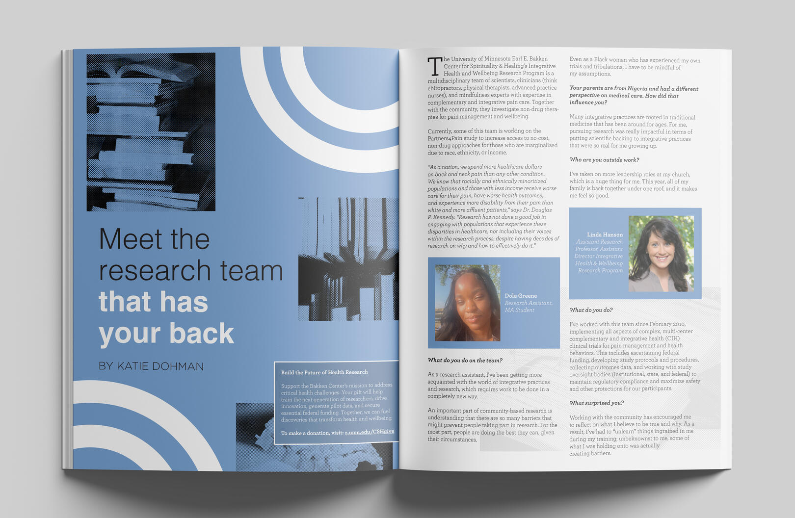
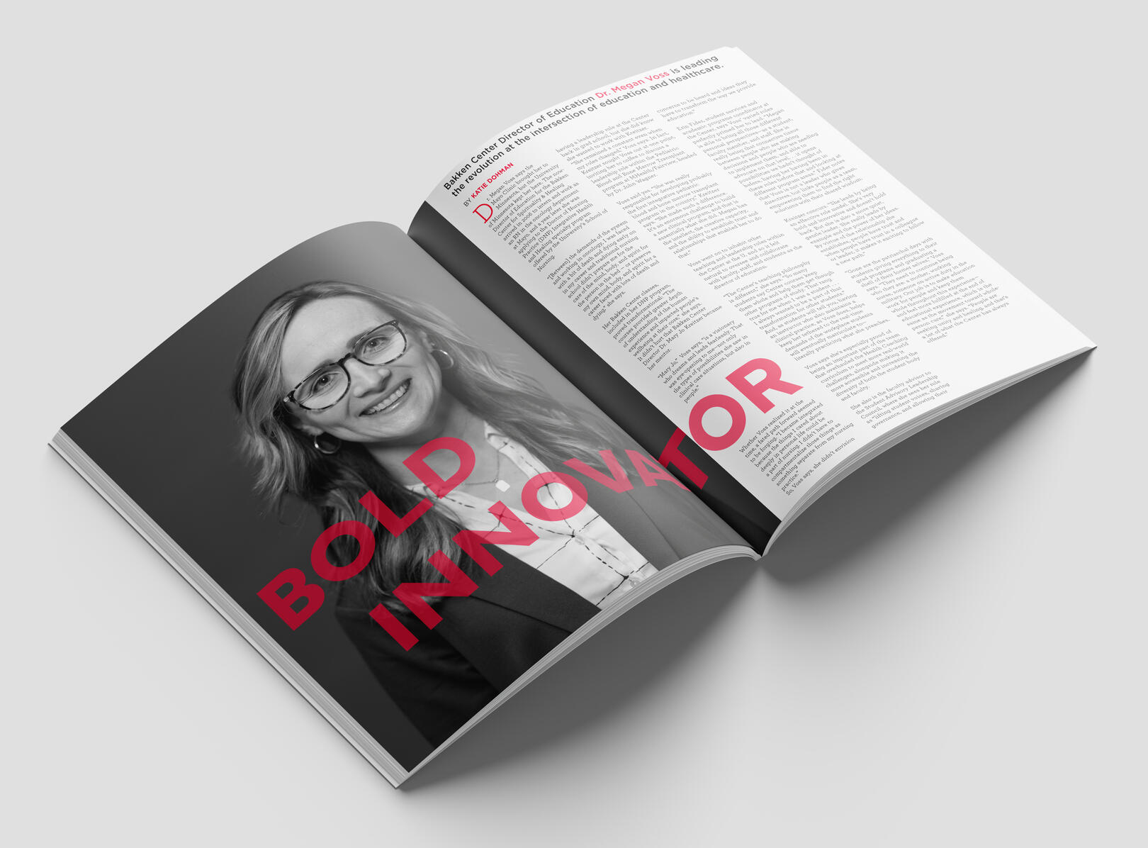
The Earl E. Bakken Center for Spirituality & Healing is an academic department at the University of Minnesota specializing in personal/community health and wellbeing. The Bakken Center primarily provides health and wellness related programs and courses for students as well as the community. Each of these programs receive their own unique “mini” brand identity and reach the community through flyers, ads, social posts, and emails.I had the pleasure of working on the Center’s communications team from May 2023 to May 2025. My tasks included creating course flyers, seasonal magazines, annual reports, and other brand related collateral.

COURSE/PROGRAM FLYERS
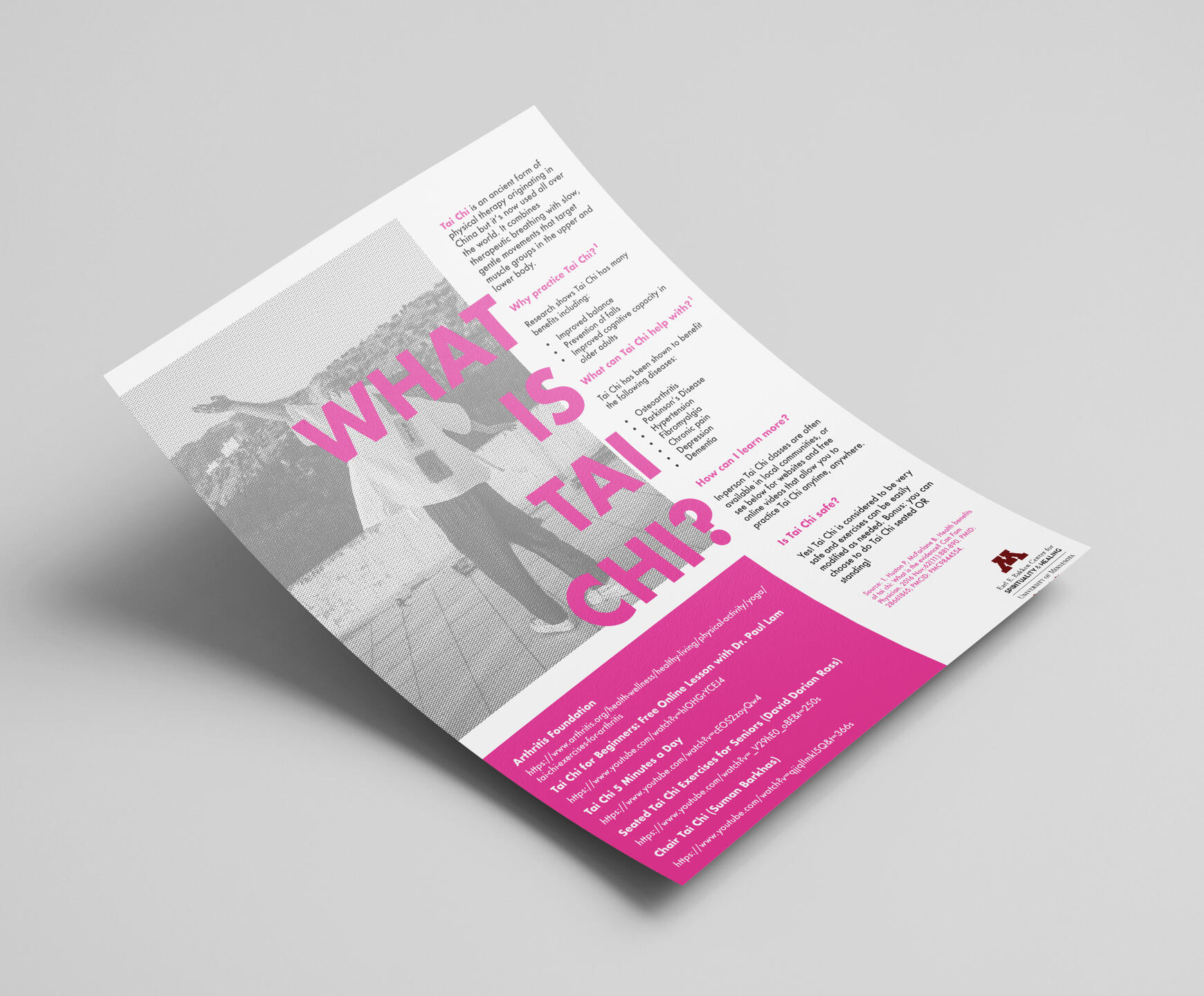
The goal of each promotional flyer is to be fun, modern, and stylish while also remaining legible and accessible for all ages. There is typically a large amount of content and copy that goes on each flyer, so it is important that the content is still presented in a clean way.


ANNUAL REPORT & MAGAZINE SPREADS
ODDS AND ENDS
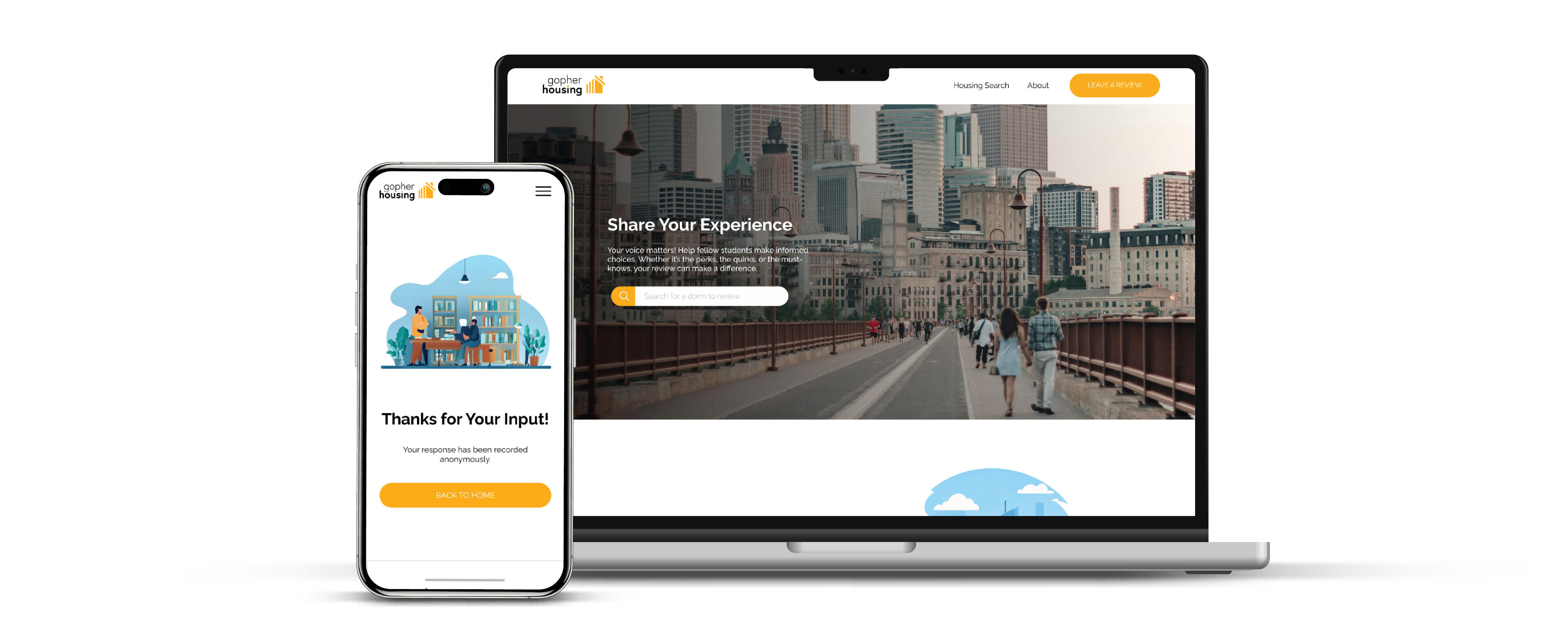
Gopher Housing: Understanding User Needs to Redesign a Student Housing Review Service
OVERVIEW
In this case study, I explore the redesign journey of Gopher Housing, a student housing review website for the University of Minnesota, aiming to improve usability, engagement, and credibility. While the previous design contained all necessary functions, the reviewing and browsing features were somewhat convoluted and in need of an update. Utilizing user research, wireframing, and prototyping, a simpler, more user-friendly solution was reached.
ROLE
UI/UX Designer
TIMEFRAME
3 Months
TEAM
Fullstack Developer2 Frontend DevelopersMarketing SpecialistMyself (UI/UX, Graphic Design)
Gopher Housing is a student housing review website specifically designed for current or upcoming students at the University of Minnesota. The website allows the user to browse all university-owned housing, look at reviews, and leave an anonymous review on their chosen dorm or apartment. The goal of Gopher Housing is to create a housing review system that is “by students for students”; this site ensures that upcoming students are able to make informed decisions on their housing choice and allows current students to voice their opinions anonymously.
WHO IS THE USER?
Being a student housing-oriented service, Gopher Housing targets college students as its primary audience. These college students can be broken into two categories: future/upcoming students and current/former students. These two categories typically use Gopher Housing for either browsing dorm reviews or leaving dorm reviews.This means that there are two primary user personas for Gopher Housing. One embodies the upcoming student at the University of Minnesota, who needs a clear and simple way to view information/reviews on student housing, as this is one of the biggest decisions of their college career. The other embodies the current or former UMN student, particularly one who has lived in one of the housing options presented in the website. This user needs a streamlined and quick way to rate and share their opinions on student housing anonymously.
THE PROBLEM SPACE
Upon launch, Gopher Housing initially had a fairly simple flow and contained all of the necessary functions for reviewing and browsing the University of Minnesota’s student housing options. After some time and user feedback, we found that many users felt there was a need for more clear navigation, a simpler reviewing system, and more filtering options when browsing.


The lack of clear navigation made it difficult for the user to find the information they need. They may be looking for their next housing choice or they may be looking to leave a review on their current dorm/apartment.
The reviewing system was somewhat complicated, as rather than rating a dorm out of 5 overall, four smaller metrics were rated out of 5 (building, location, etc.), which would then contribute to the average overall rating of the dorm out of 5.
Filtering is an important tool to have for students who are considering their housing choice. While Gopher Housing did feature some filtering options, these options were somewhat obvious (highest social rating, highest food rating, etc.). Many students voiced that it was important for them to know how many individuals shared a common school/major with them in each dorm.

The lack of clear navigation made it difficult for the user to find the information they need. They may be looking for their next housing choice or they may be looking to leave a review on their current dorm/apartment.

The reviewing system was somewhat complicated, as rather than rating a dorm out of 5 overall, four smaller metrics were rated out of 5 (building, location, etc.), which would then contribute to the average overall rating of the dorm out of 5.

Filtering is an important tool to have for students who are considering their housing choice. While Gopher Housing did feature some filtering options, these options were somewhat obvious (highest social rating, highest food rating, etc.). Many students voiced that it was important for them to know how many individuals shared a common school/major with them in each dorm.
PAIN POINTS
After synthesizing some of the user feedback we received, we were able to gain some insight on some of the challenges that the average Gopher Housing user was facing during their housing review/browsing experience.
Navigation/Header
Lack of navigation items in the header upon loading page
Little information given on the process of leaving a review or looking at reviews
Uneven margins between header elements


Filter/Sort Functionality
No real filtering options
Multiple filters can’t be selected at once, filter function is presented more as a sorting function
Some simple filters, would benefit from more school/major related filters
Review Process
Rating four separate metrics out of 5 rather than rating the dorm/apartment overall out of 5 makes the process unnecessarily complicated
“Write a Review” is too close to the star section and looks like a continuation
Little contrast between the heading font of the section and the reviewing metrics

REDESIGN GOALS & PRIORITIES
The design goals of Gopher Housing are simple: make the process as easy as possible while keeping in mind the needs of both types of users.


Build trust between the user and the platform. Inconsistencies such as uneven spacing between elements, font sizes, and alignment make it difficult for trust to be built between Gopher Housing and its users. This can be expanded upon with updated branding and colors.
Simplify the experience. Making the review process simpler and more streamlined helps bring more users to engage with the service. The easier it is for the user to navigate and understand the process, the more users there will be.
Prioritize the mobile experience. Mobile functionality is important for services specifically targeted at younger users, as many prefer to be able to use these services while on the go.

Build trust between the user and the platform. Inconsistencies such as uneven spacing between elements, font sizes, and alignment make it difficult for trust to be built between Gopher Housing and its users. This can be expanded upon with updated branding and colors.

Simplify the experience. Making the review process simpler and more streamlined helps bring more users to engage with the service. The easier it is for the user to navigate and understand the process, the more users there will be.

Prioritize the mobile experience. Mobile functionality is important for services specifically targeted at younger users, as many prefer to be able to use these services while on the go.
WIREFRAMES
During the sketching and wireframing process, the main goal was to ensure that the user can build and maintain trust in the platform. This meant keeping all information simple, all navigation clear, and all design elements clean/consistent.
Updated Header/Navigation
Gives user access to the two main functions of the service in addition to the home page and an “about” page

Home Page

Dorm Info Page

Search/Browse Page

Review Page

FINAL DESIGN
With the user needs, pain points, and feedback in mind a fresh new design was created for Gopher Housing. This new design prioritizes structure, navigation, ease of use, and a cleaner appearance.
BEFORE

AFTER

NEW HOME PAGE
Hero Section
A simple introduction to the service
Includes a search bar for fast access to a particular dorm
"How it Works" Section
Gives basic information on the two main functions of the service
Helps upcoming students as well as current/former students to better understand the process
Popular Dorm Carousel
Displays a short list of the most reviewed housing options
Button leads to the browse page


SEARCH PAGE
Simpler and Cleaner
Fresher overall look
Multiple pages rather than all dorms/apartments being
displayed on one continuous pageFilter and Sort are two separate dropdown menus
Filter/Sort Menus
Ability to sort by number of reviews and high/low ratings
Multiple filters may be selected at once
Ability to filter by user’s selected school

DORM INFO PAGE
Overview
Provides a description of the chosen dorm/apartment
Shows a breakdown of the optional metrics that can be filled during review
Also shows data representing the most prominent schools in the dorm
Reviews Section
Displays the overall rating out of 5 given by the reviewer
Date of the review can be seen below the rating
Any comments left can be viewed below the rating and date


LEAVE A REVIEW
Simpler Reviewing
Overall rating out of 5 is prioritized and placed at the top
Other metrics and user’s current school are made optional and
placed below the main review section
UPDATED BRANDING
BEFORE

AFTER
MOBILE CONFIGURATION


LEARNINGS & CHALLENGES
Teamwork is crucial in redesign projects in order to make sure that the whole team’s voices are heard and their strengths are utilized.
It was challenging to find ways to increase user trust aside from simple errors such as alignment and general tidiness.
It is important that usability testing is conducted among a wide range of users rather than concentrated groups in similar settings.
THANK YOU!